Irena Zablotska, AKA Joulu, is a Ukraine-based illustrator living in Lviv. She is the co-founder of Keepa, a design studio who specializes in illustration, graphic, web and interface design.
Her work has been featured in magazines, Huck, Caldonecultivo, Deleted Scenes; while working editorial and advertising for clients, such as, Elle and EPOS.
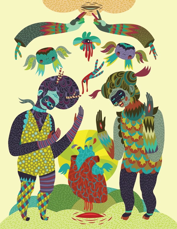
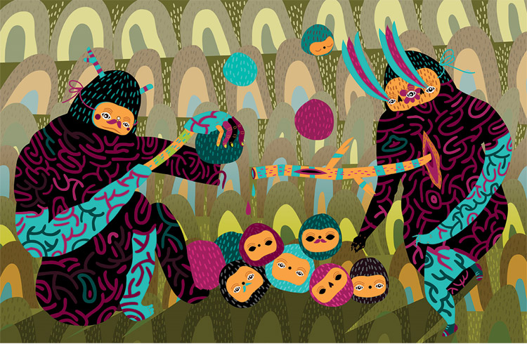
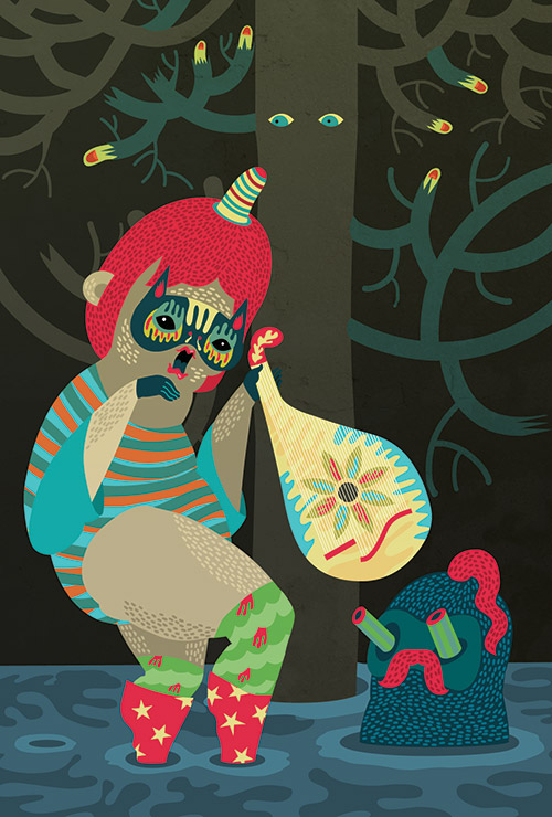
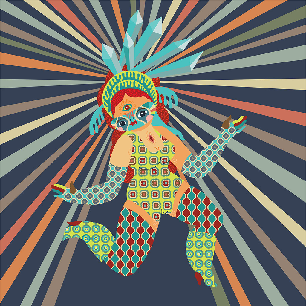
Co-ounder of Keepa, a design studio. Her work is a beautiful combinations of bold shapes, strong colors and geometric patterns inlaid within them. Her sense of storytelling reminds me of ancient cave paintings depicting the life of some
ancient tribe.

Julia Hepburn knows what a good story feels like. The scenes in her doll-sized vignettes give us the sense of catching a dark fable somewhere in the middle.The plot may be missing, but the settings, characters, and their tragic/comic relationships have all the qualities of belonging to a great tale in line with those of the Brothers Grimm.
As in the best Victorian or Teutonic tales, animals and humans intermingle, exchange roles, become friends and antagonists. There’s always an edge of threat to even the most obviously comic of scenes. An apron-wearing seagull raises a large cleaver to cut another slice from severed thumb in “Sometimes Seagull’s Don’t Beg” (below left). Somehow Red Hen’s parachute failed to open in time (“The Death of Red Hen” below, right). In “Julia’s Murder” (below, center), one doesn’t know the crime has happened already or is about to take place.

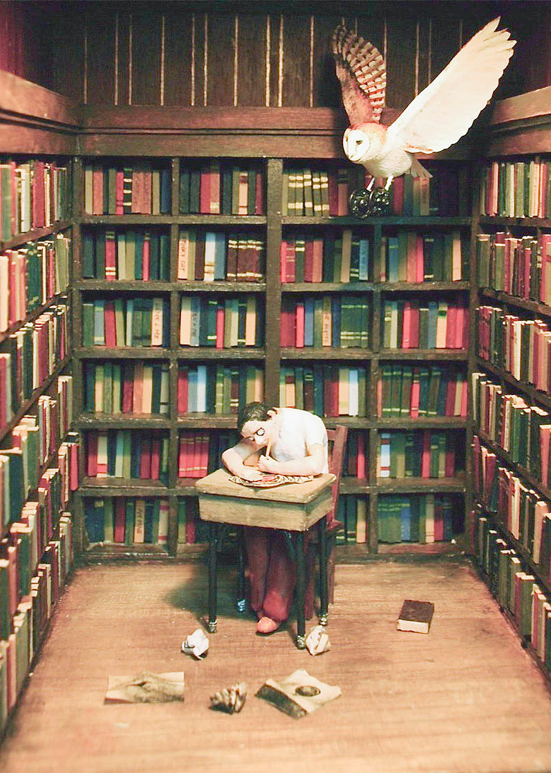
“The works reflect my desire to re-insert myself into the natural order and often exhibit my tendency to assign human personalities to animals.” — Julia Hepburn
Though the tendency is to lean right into one of Julia’s tiny worlds, we’re keep apart from them by their encapsulating frames, boxes and lanterns. Like waking up from a dream your were becoming too involved in, the frames provide a sense or relief and a reminder that they’re only stories.
Originally published on Nov 20 2010
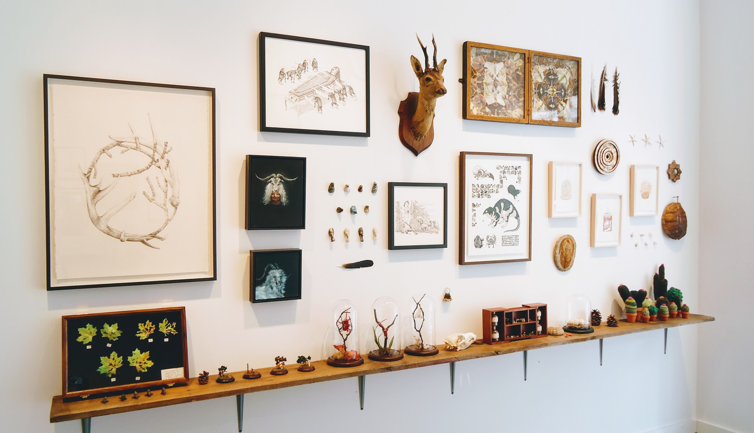
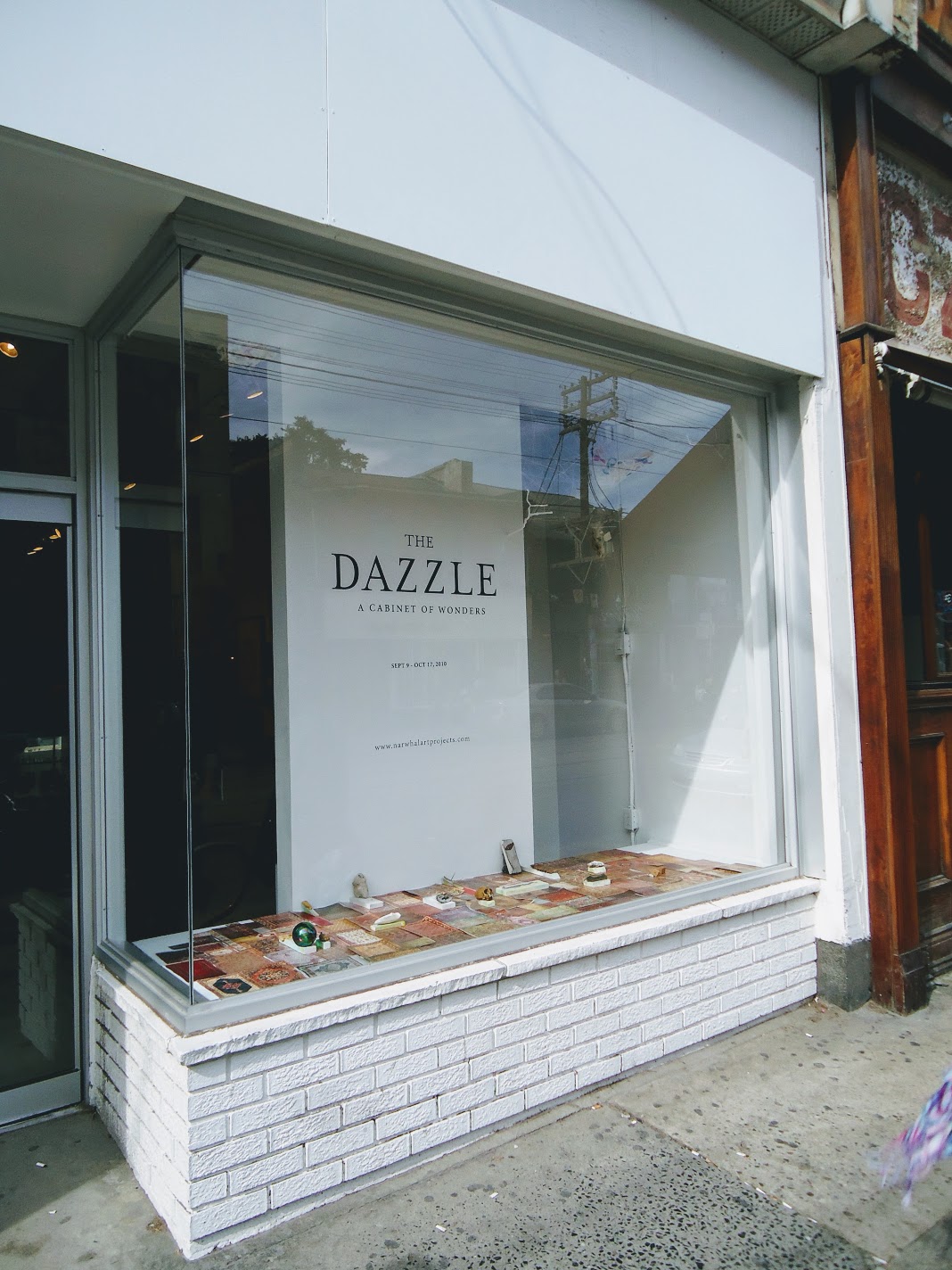
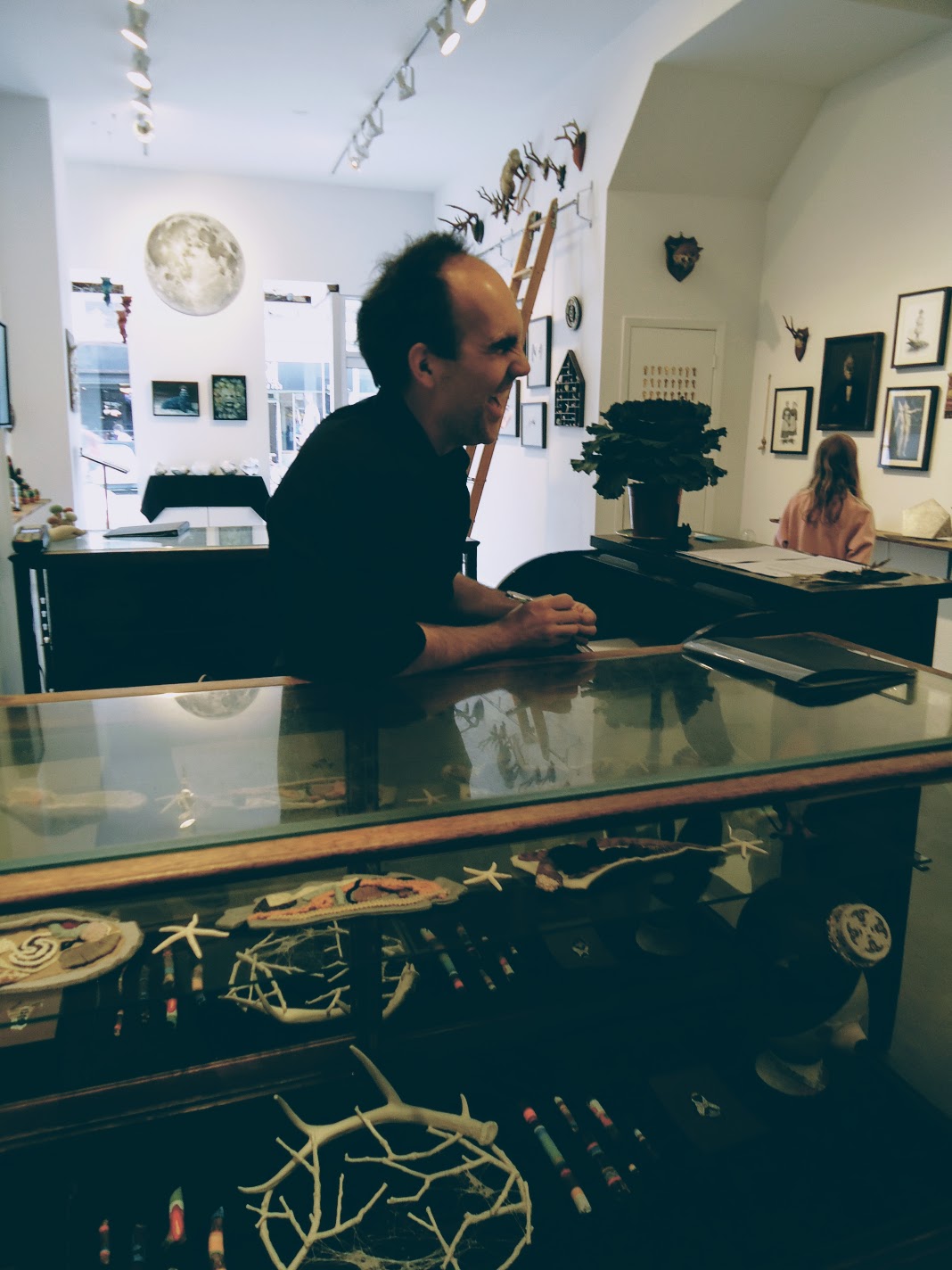
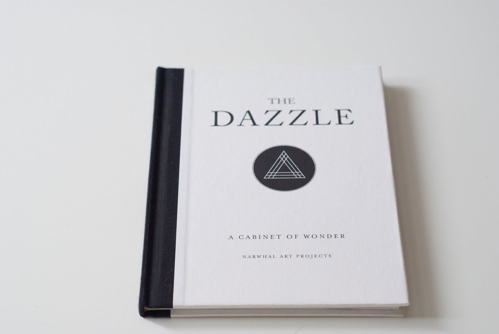
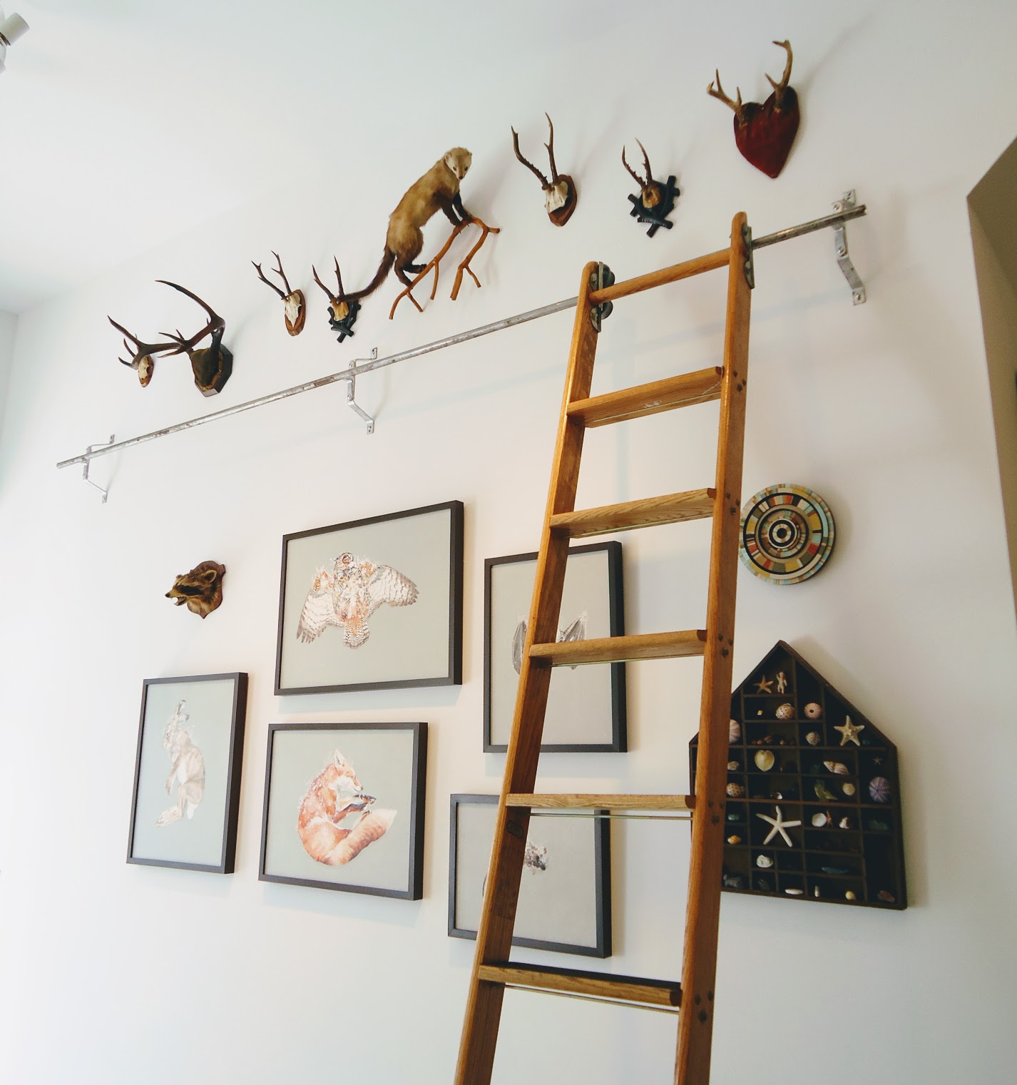
Walking into The Dazzle exhibition, at Narwal Art Projects in Toronto, is like entering the private museum of some forgotten masonic lodge. It’s an unsettling and wondrous experience which invites you to wander and examine the collection of artifacts from over 30 contributing artists.
It’s easy to forget that you’re visiting a downtown art gallery while surrounded by taxidermied baby albino unicorn goats, aged oil portraits of masked dignitaries, occult emblems, exquisite mineral formations, scenes of pagan rites, jewelery, Jesus snatching squirrels, bones, and knitted cacti.
Described as “a study and celebration of collection fetishism”, The Dazzle raises questions about the impulse to seek out the strange and unknown, to catalog and collect artifacts from the fringes of the known world.
All works shown here are copyright of the originating artists.
“My ideas come from the things I see and keep with me”
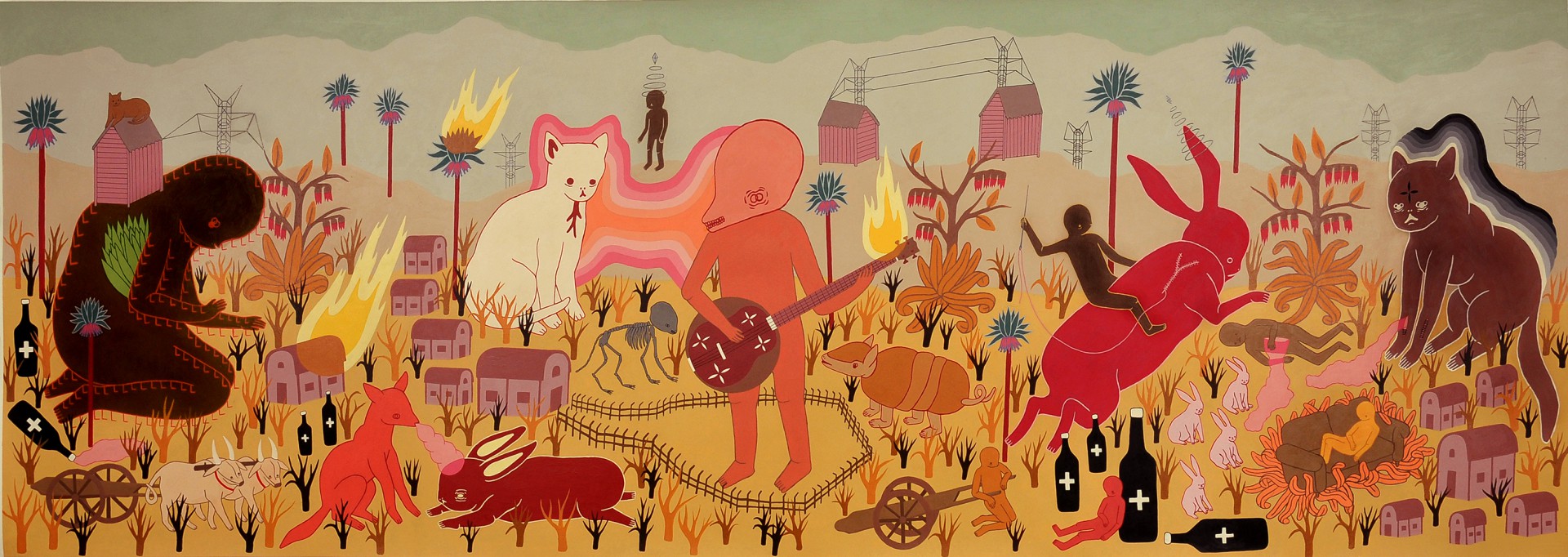
These are the beautiful paintings of Brazilian artist Talita Hoffmann. Inspired by the world around her, she says “my ideas come from the things I see and keep with me”. Her epic stories of mythical civilizations, reminiscent Hieronymus Bosch’s depictions of the afterlife, seem of a time yet to be or from some distant past. Here animals and humans coexist, sharing and building a world for both to inhabit and flourish.
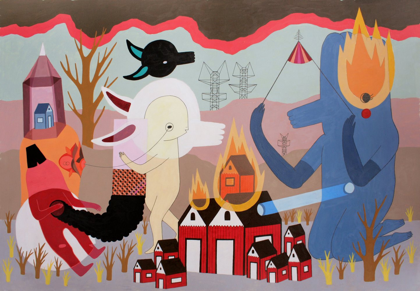
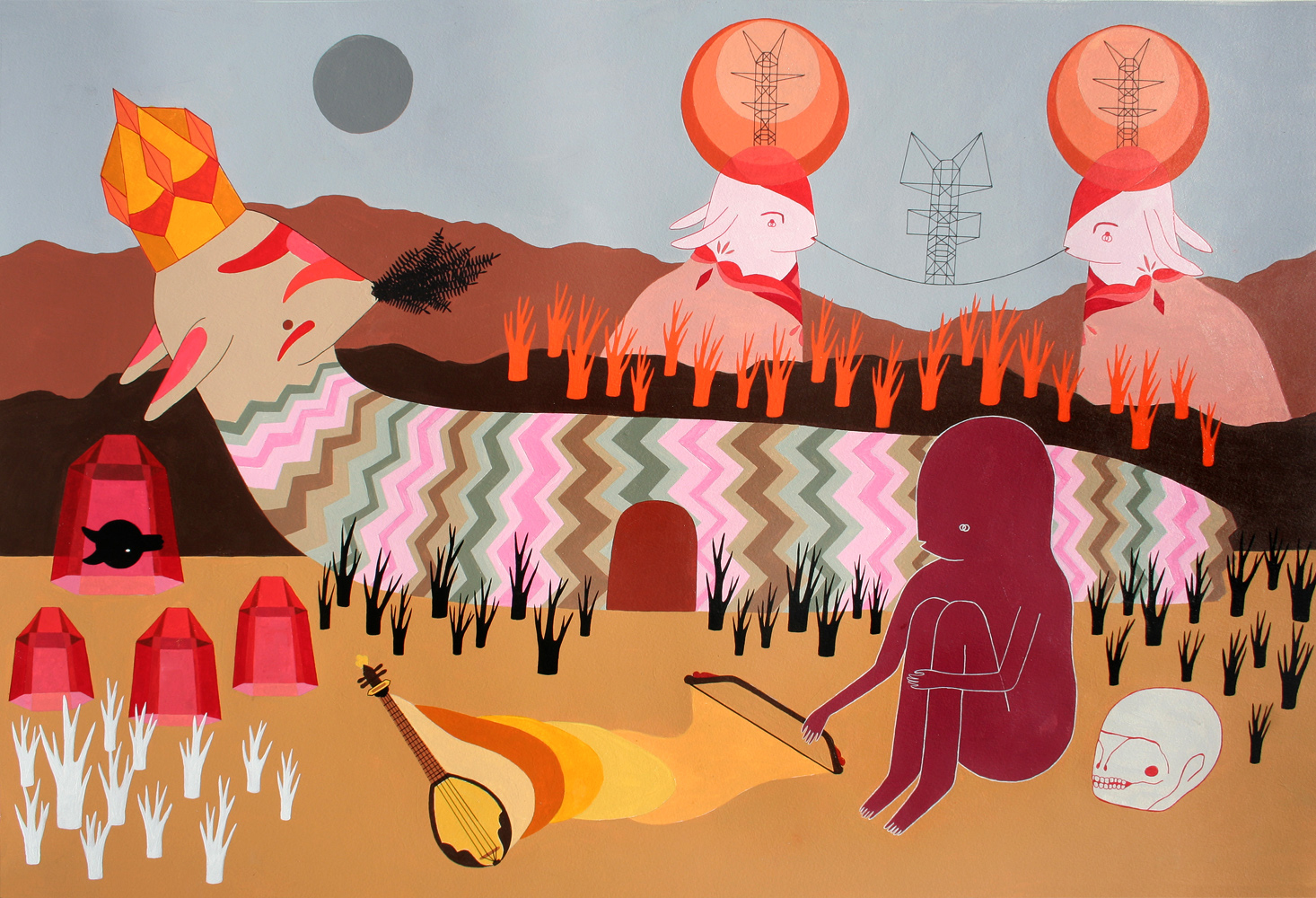
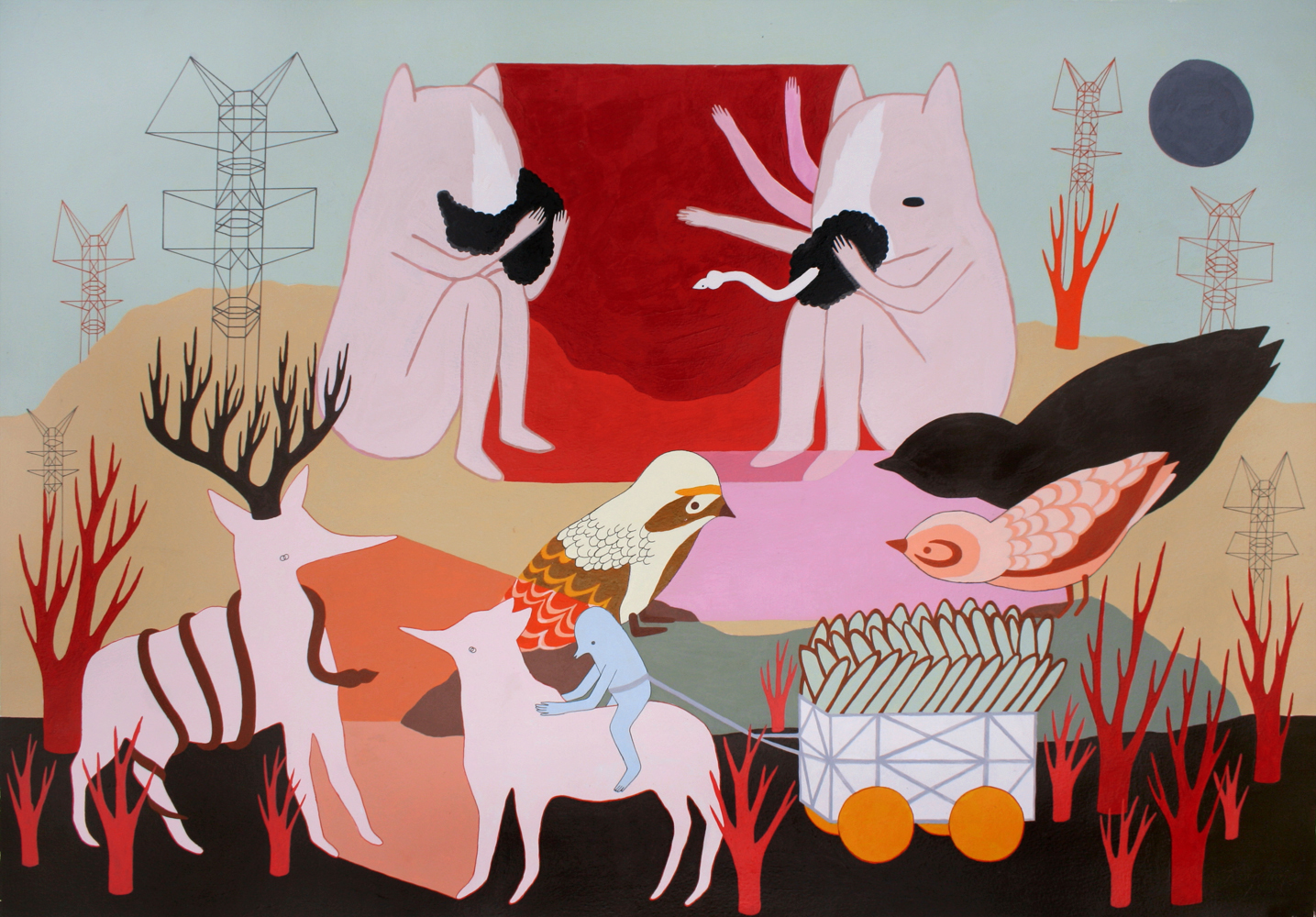
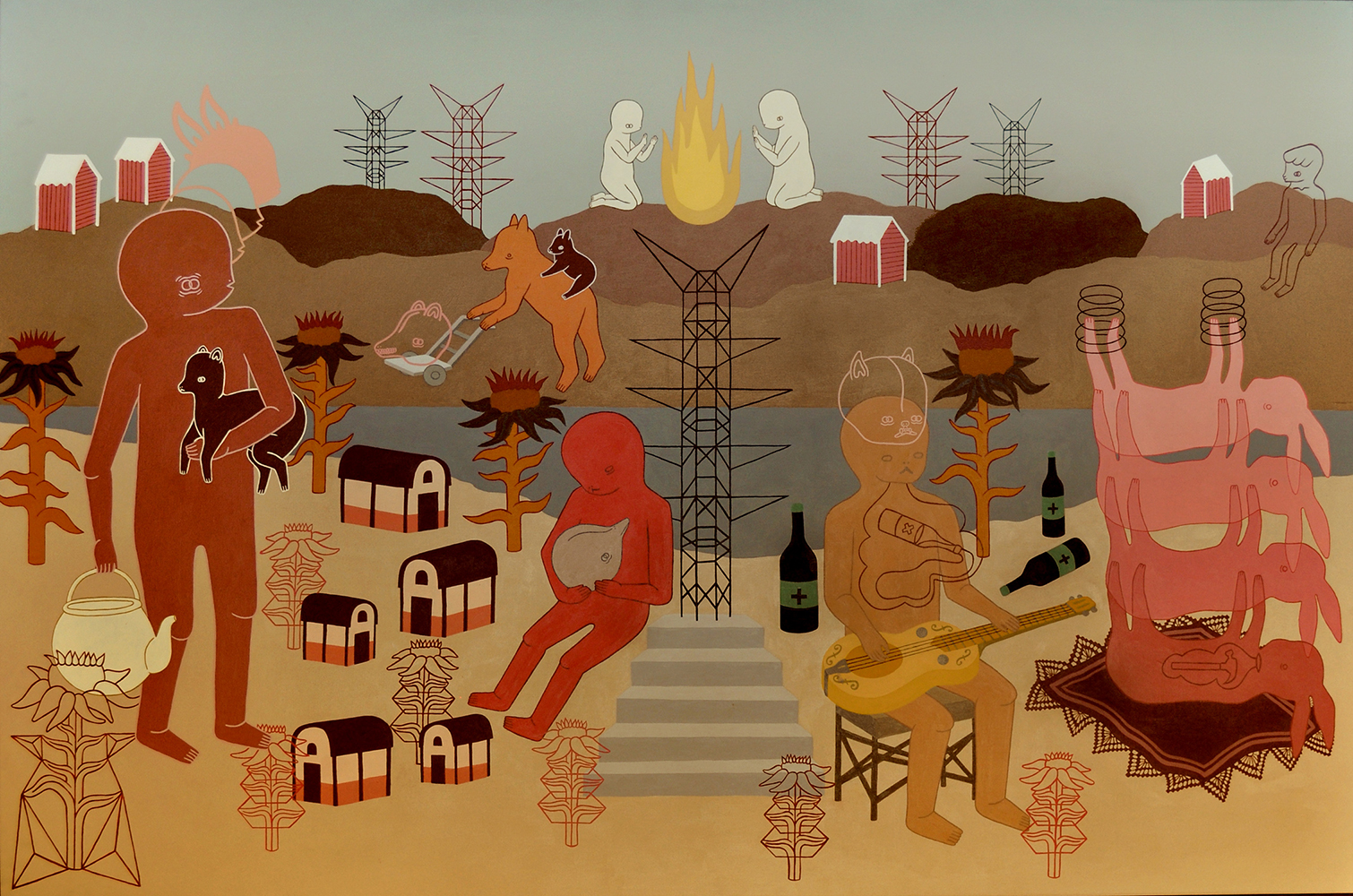
Images © 2010 Talita Hoffmann