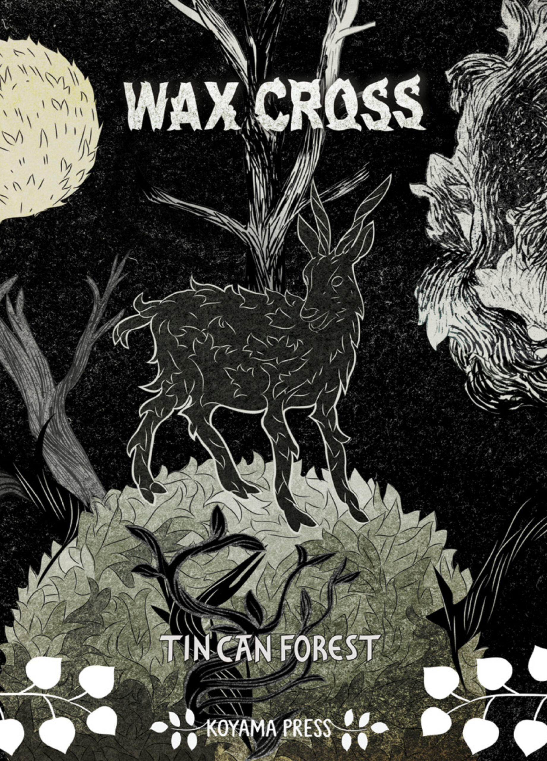
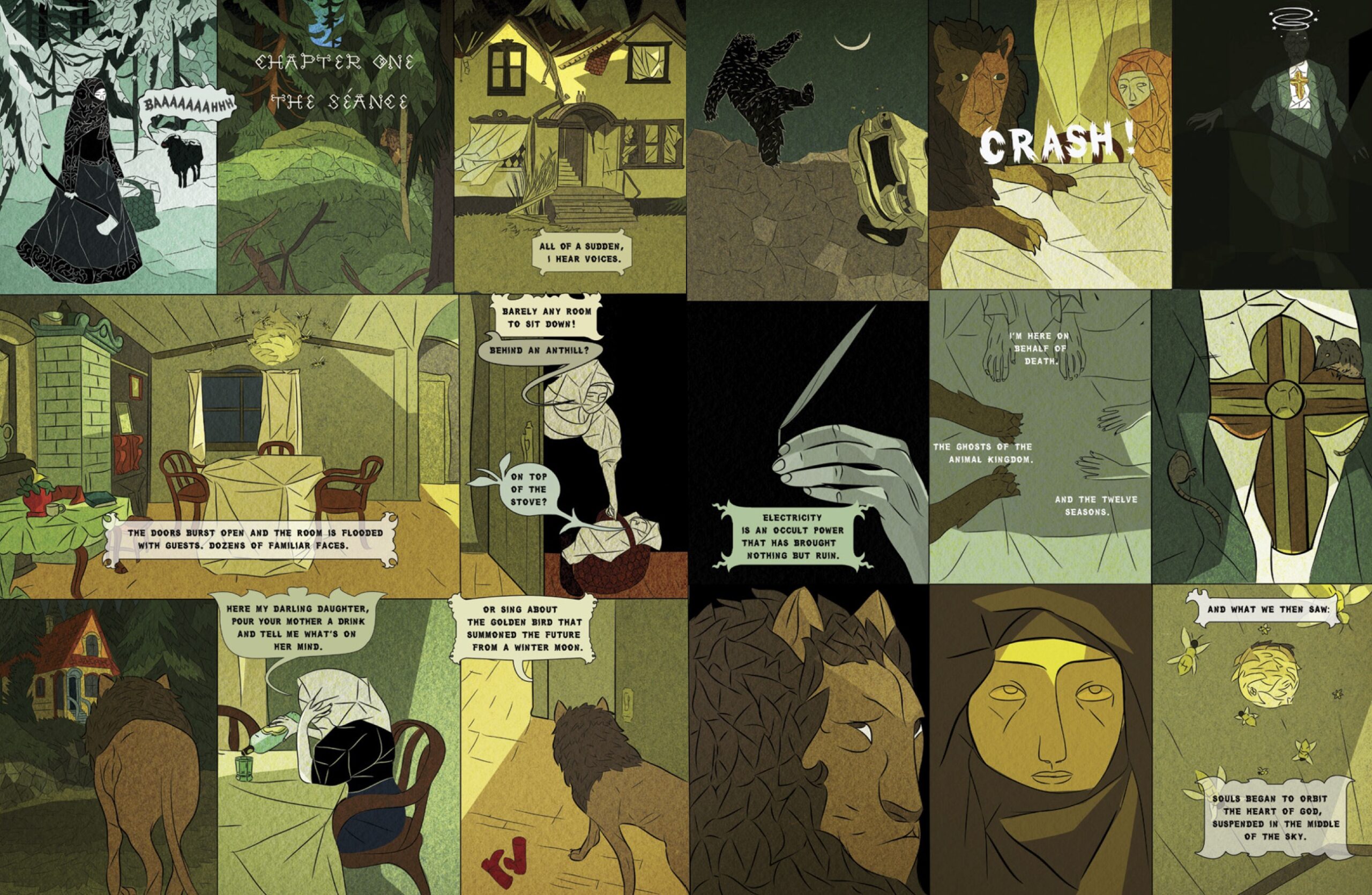
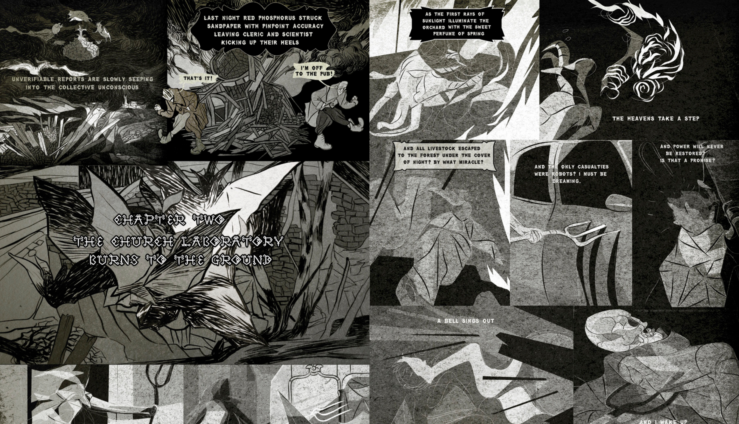
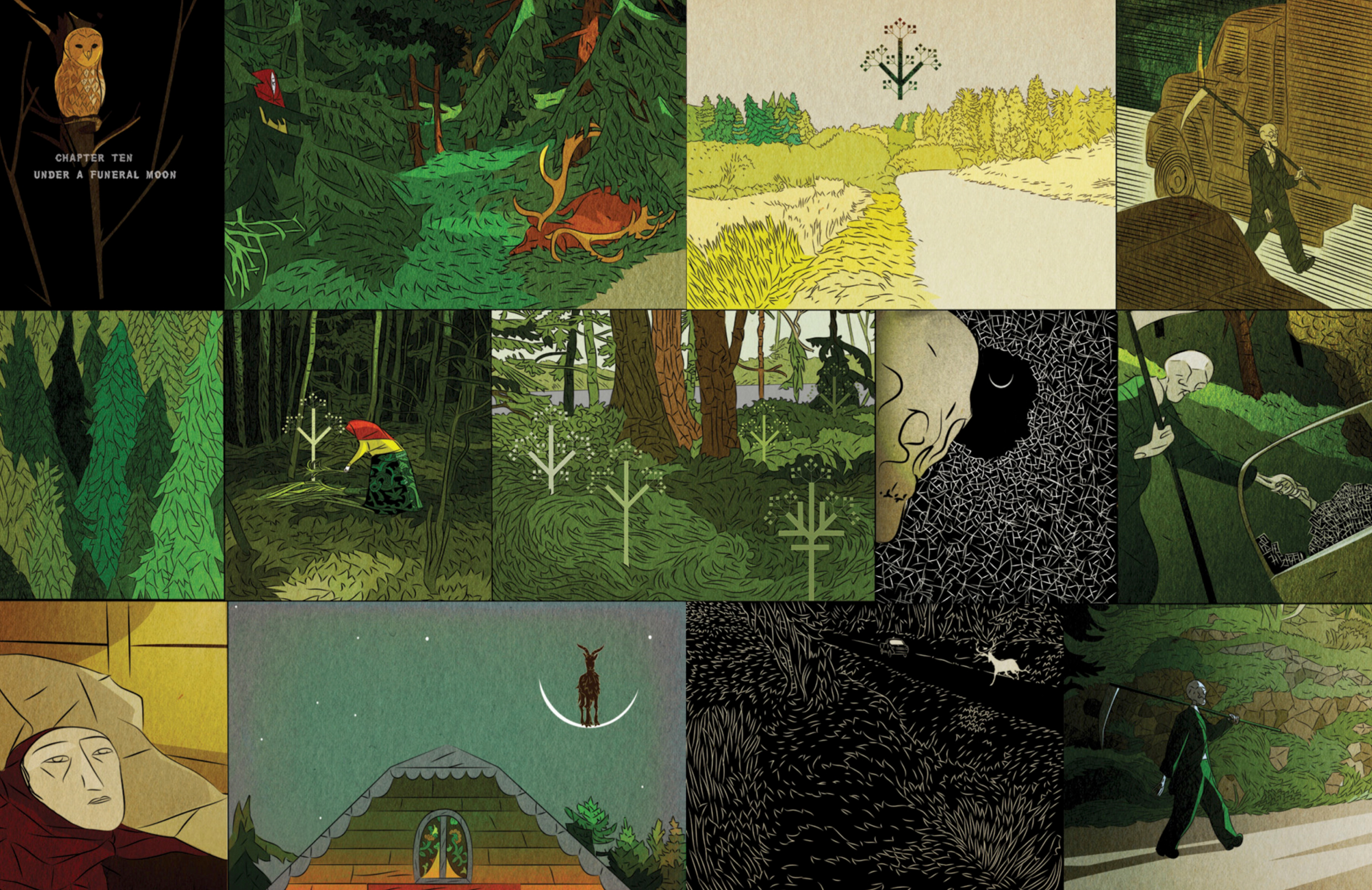
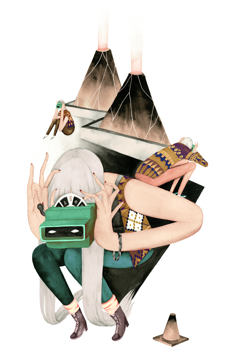
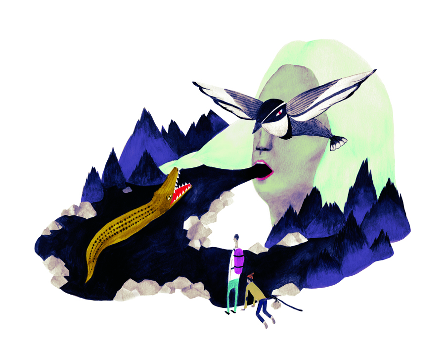
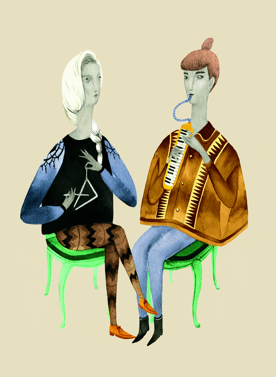
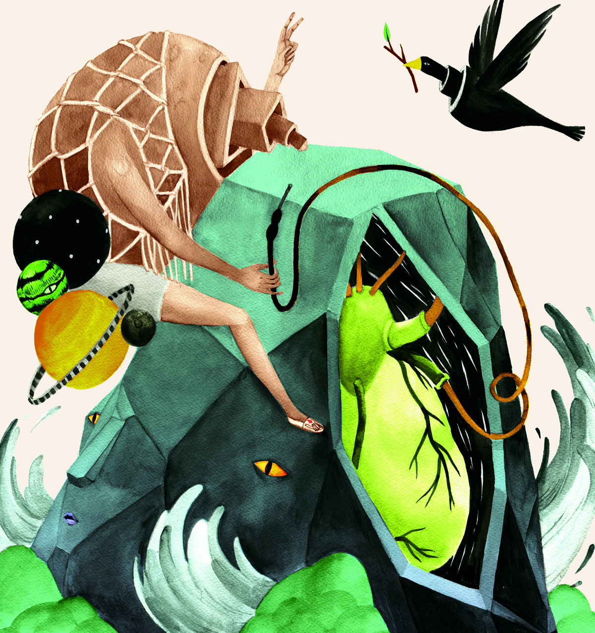
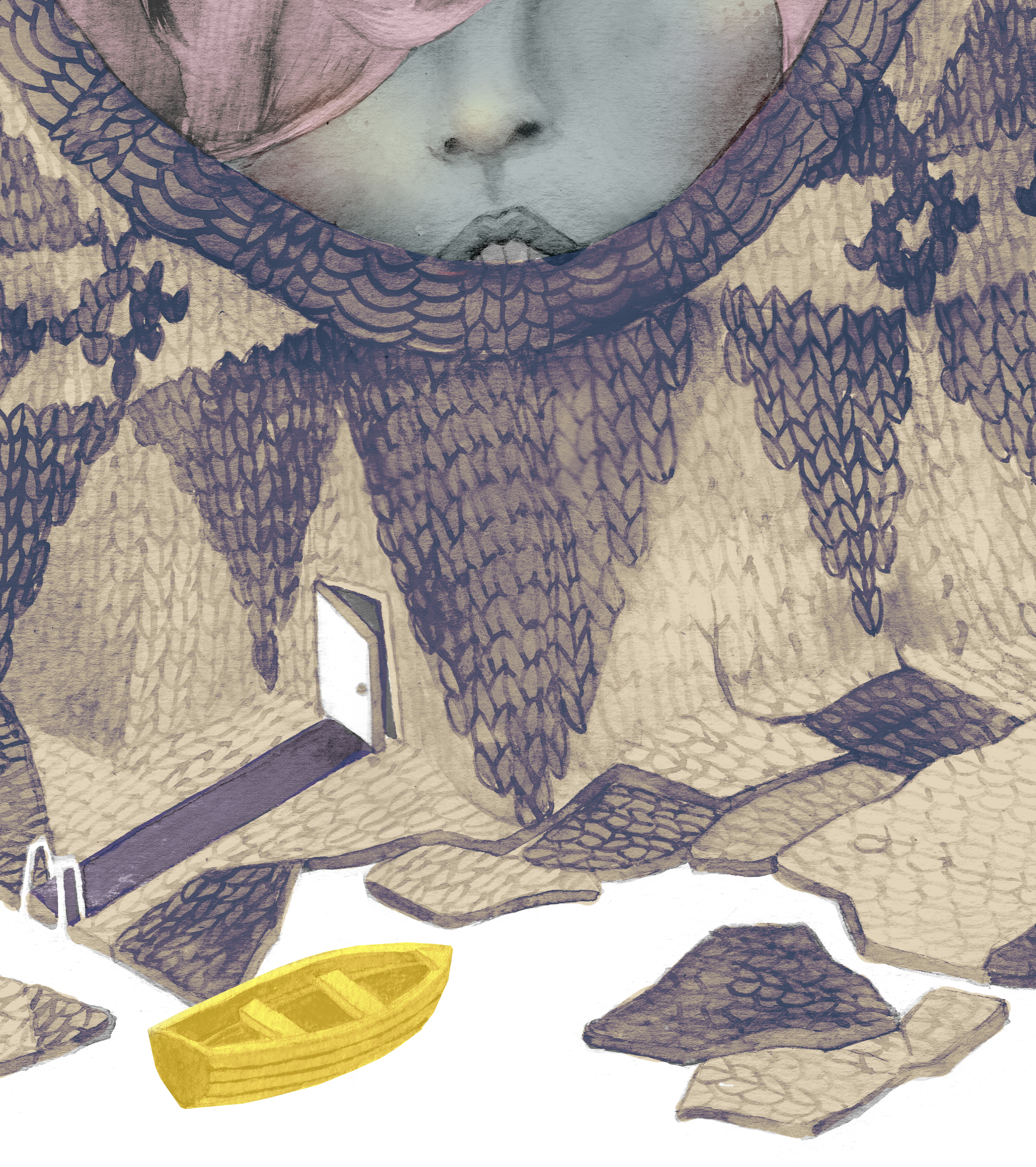
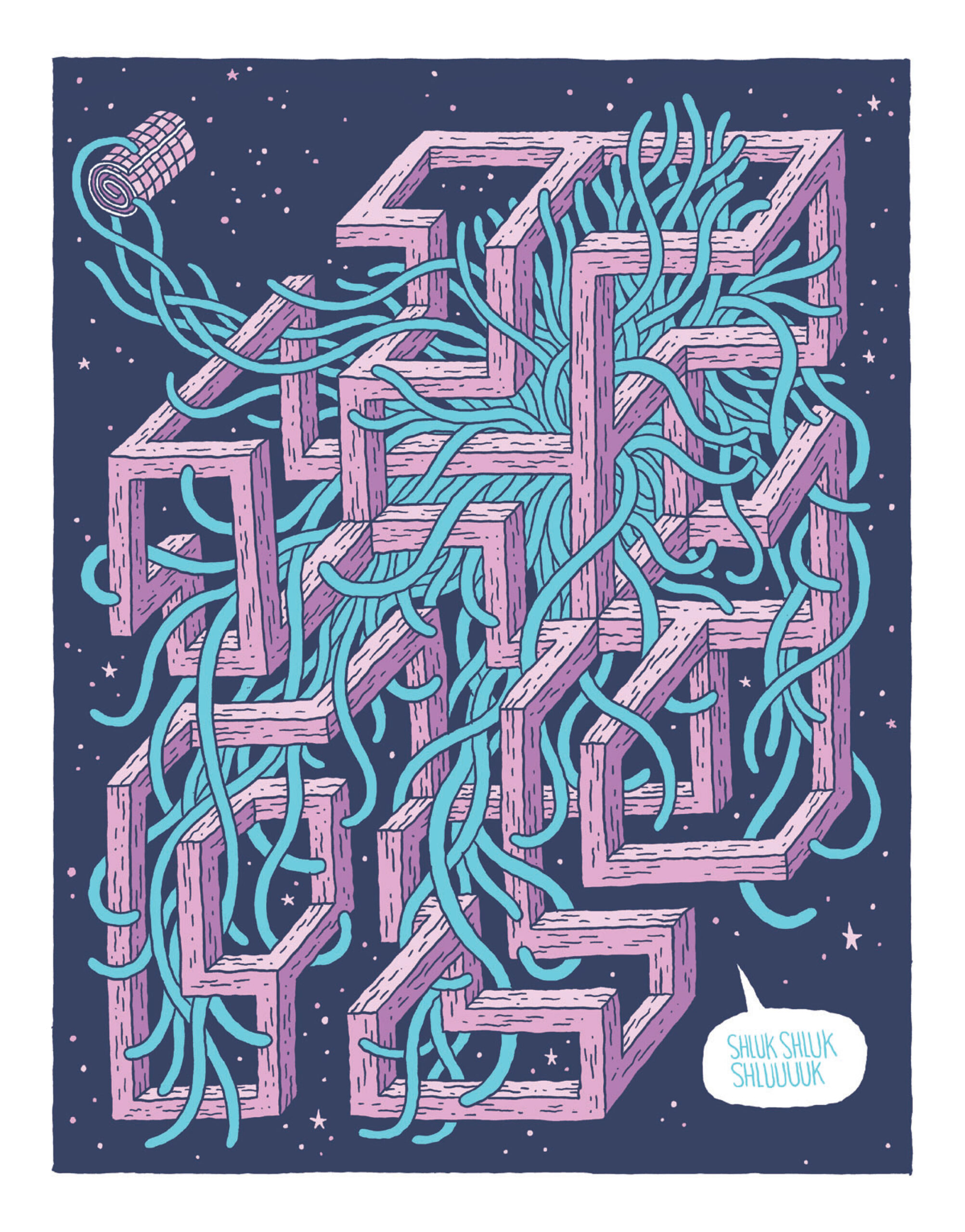
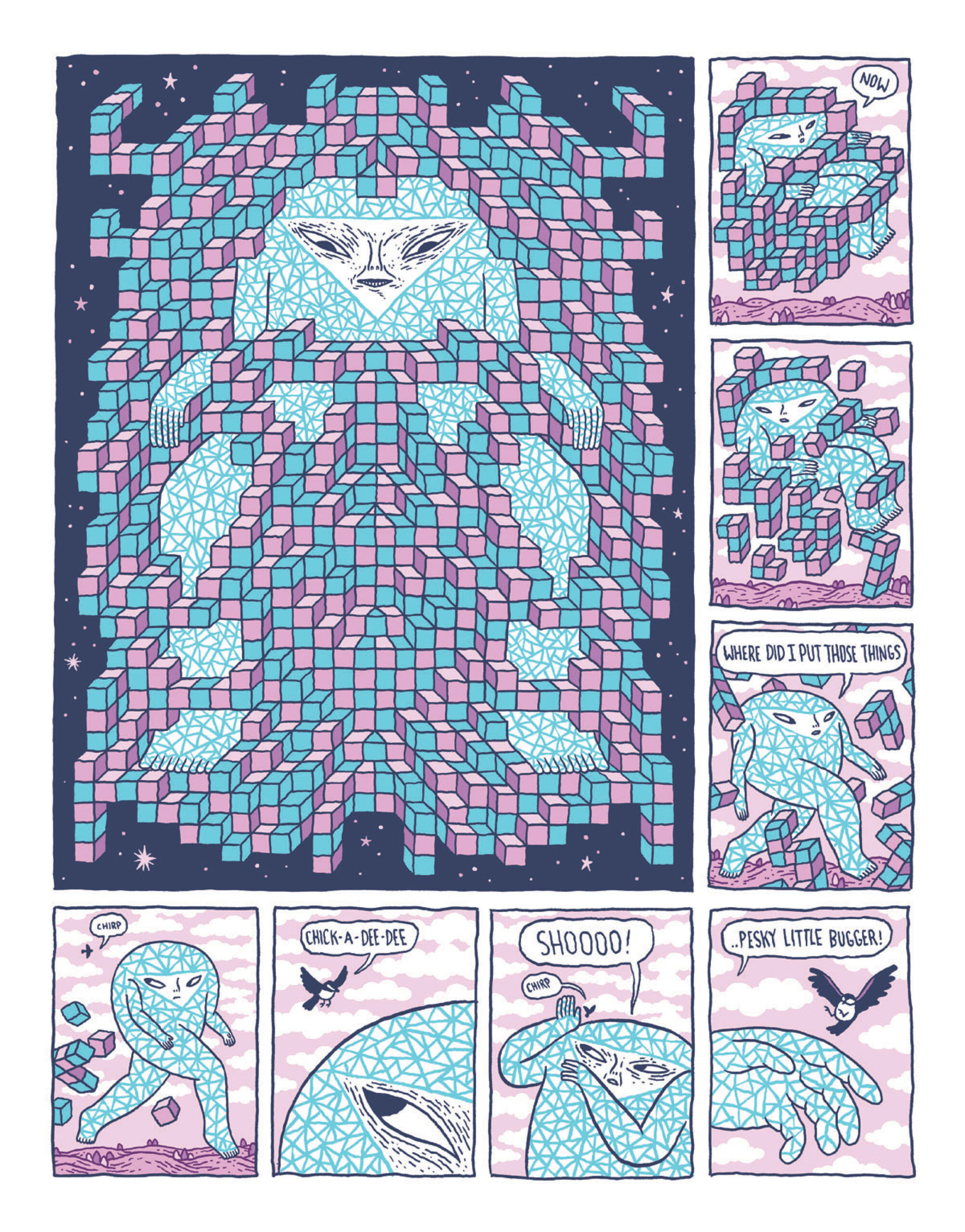
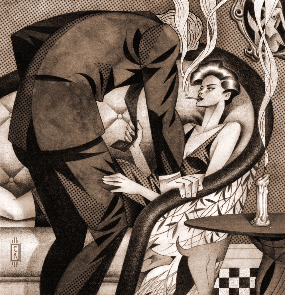
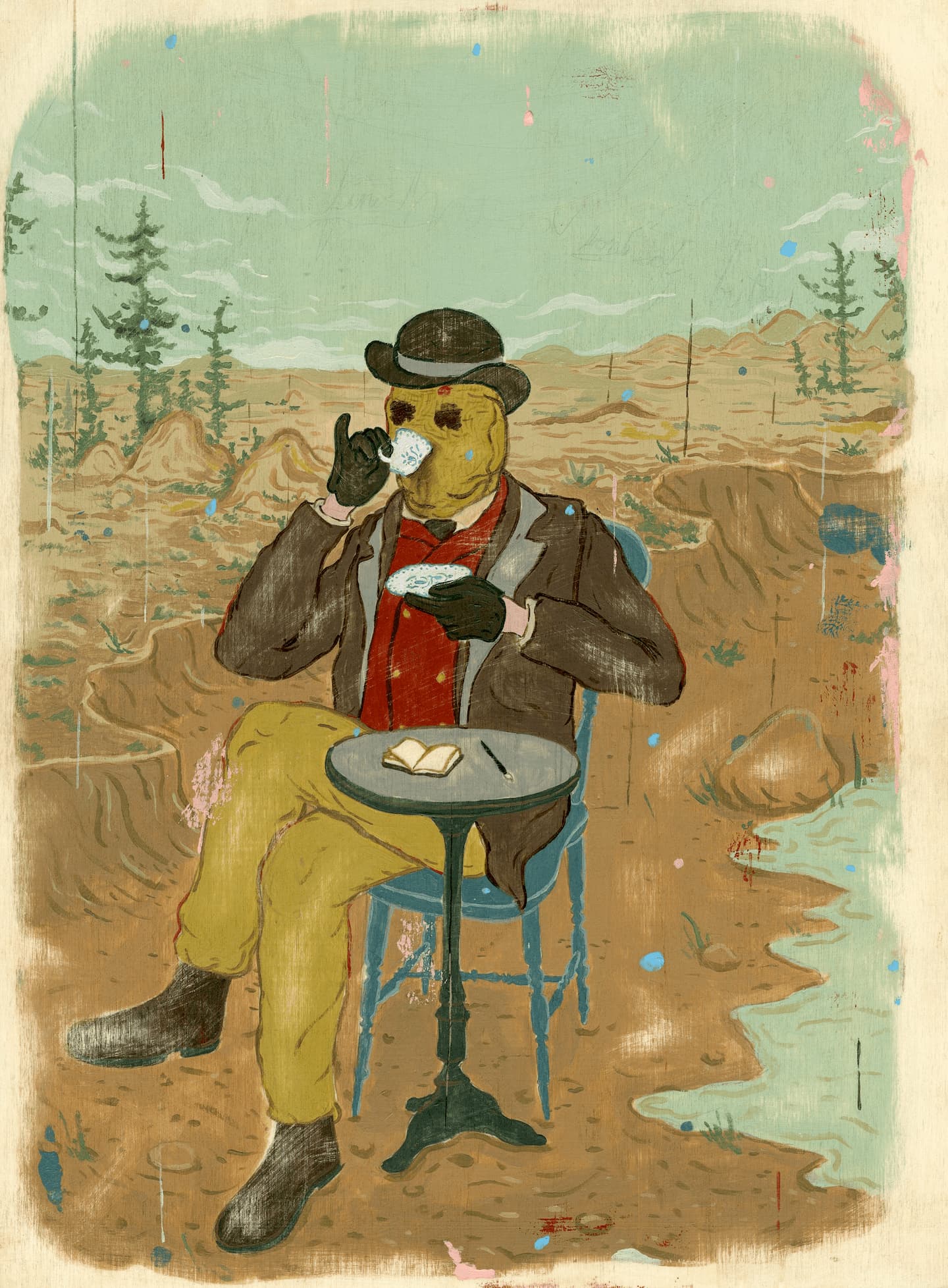
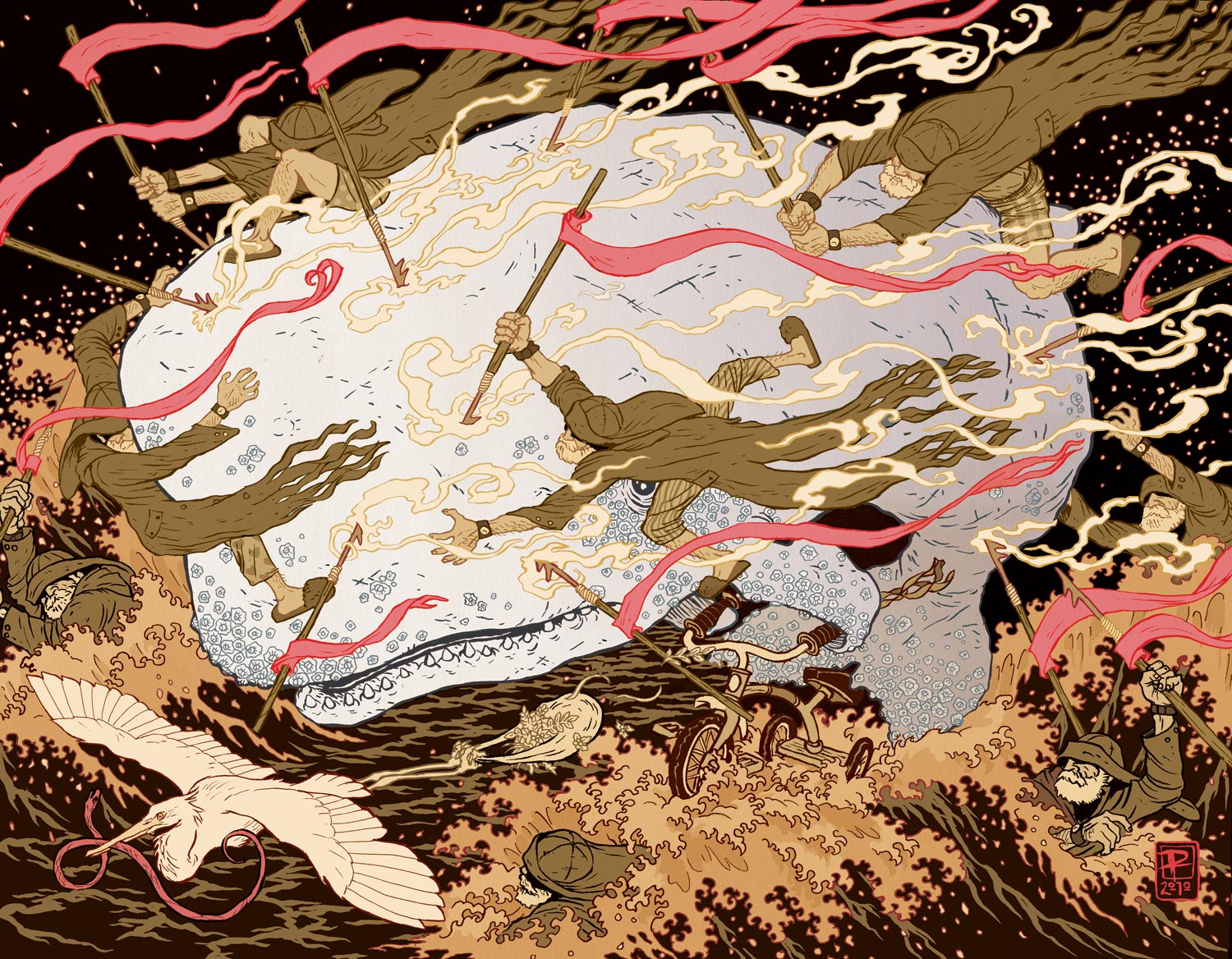
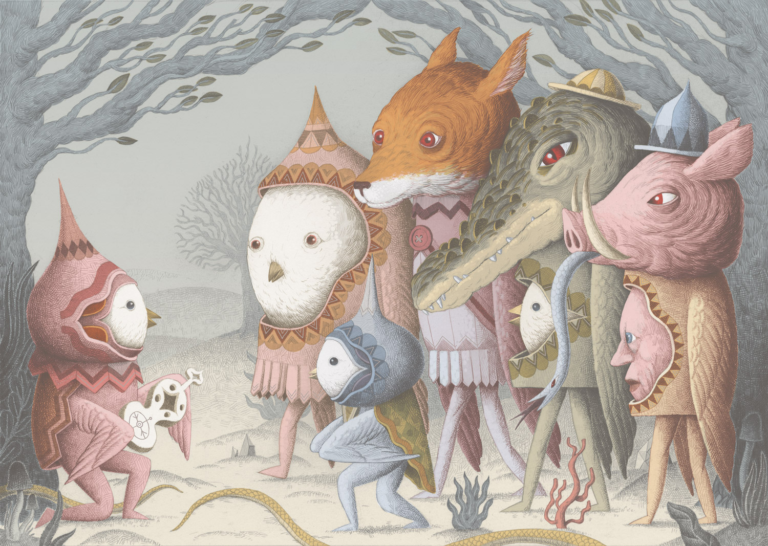
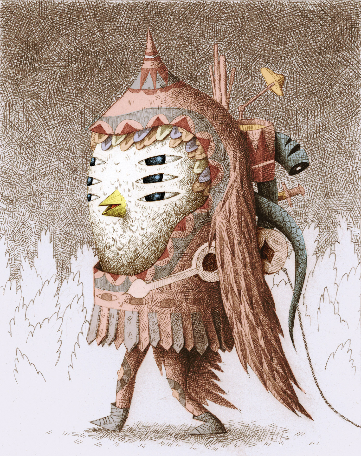
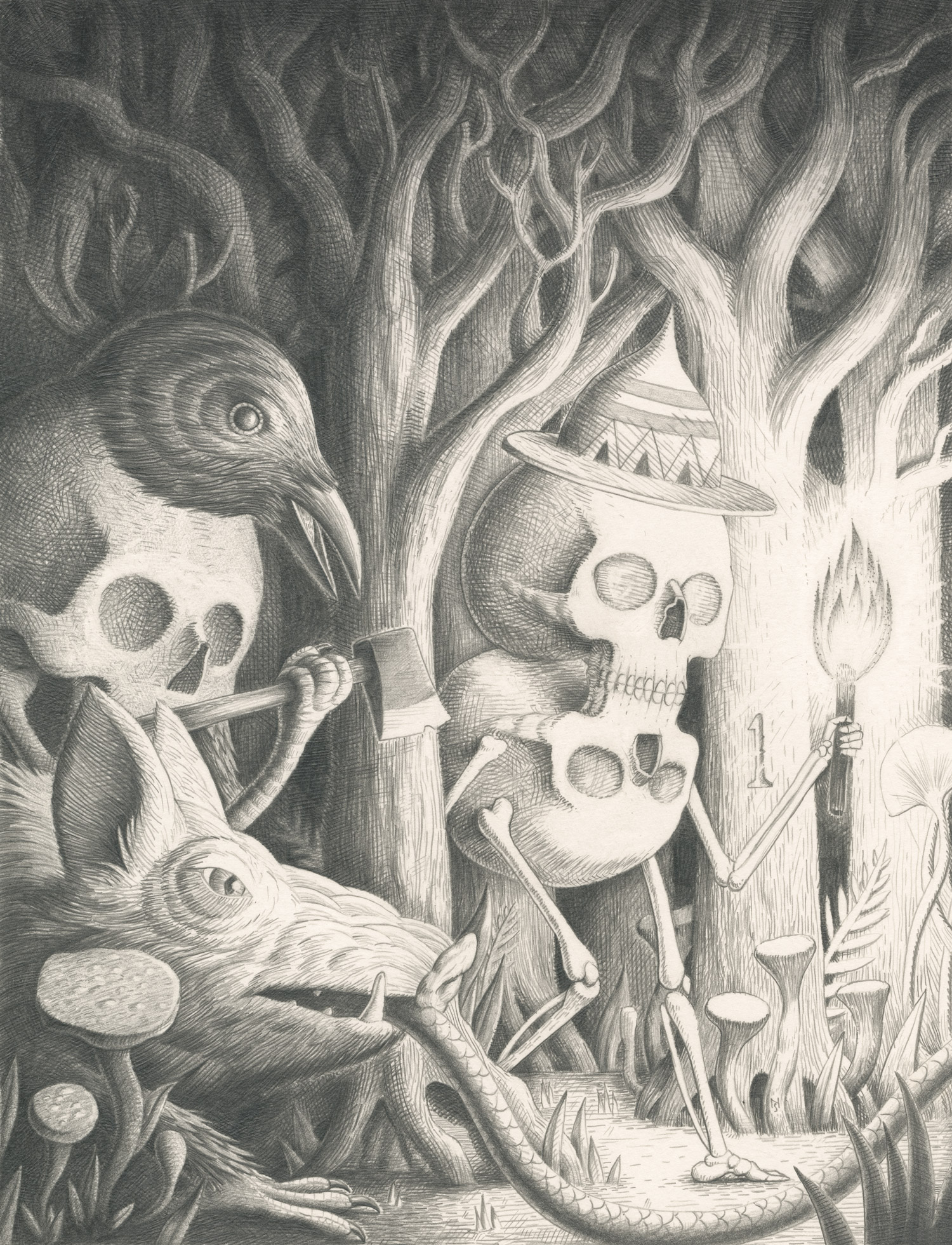
Structured as a series of linked episodes, the book reads more like a poem in chapters. Tin Can Forest (a.k.a Pat Shewchuk and Marek Colek) repurpose the visual vernacular of Eastern European folklore to spin a meditation on our severed connection to the natural world. Set in “the twilight of the modern age”
– an incantation carried on the wind sets off a chain of encounters between men, women, spirits and demons.
The book, published by Toronto’s Koyama Press, is beautifully designed, and the large format really does justice to the art.
Just like the forest at the heart of its story, Wax Cross is a dense and mysterious tangle of ideas and emotions, bouncing form devilish mirth to melancholy. The haunting poetry of its pages stays with you long after you read it.
We loved the poetic, non-linear, dreamlike approach to storytelling in this book. How did you go about putting it all together? Did the art come before the words? Was the story planned from the beginning, or did it develop naturally, more organically?
Tin Can Forest: We started Wax Cross in the winter of 2010, and the first draft was entirely in black and white /grayscale, and all the text was in the style of the incantations that now appear in the spiral on page two of the book. When spring arrived, the black and white version vanished and we began to work in colour. We produced the colour spreads from late summer through autumn. When winter re-arrived, the first version re-emerged from the furthest recesses of our paper shelves and hard drives. The final edit is the combination of the two seasonal sessions.
The governing principal of our process is always collage, but with artwork that we ourselves create rather than found imagery. We work on the art and text concurrently, and neither is subordinate to the other, more a kind of counterpoint, sometime harmonious, sometimes (intentionally) dissonant. Many of the themes explored in the book were there at the inception, but we always incorporate experiences, influences, remembered dreams, and so on, that have an impact on us during the time we’re building of the book.
In terms of the art and design there’s a noticeable shift stylistically from chapter to chapter. For us it felt like the shift of mood/scene in a sequence of dreams. Was this your intention, or was it more about creative exploration?
TCF: It was definitely intentional. We wanted the chapters to be something like different songs on album, so you could listen to/read the whole thing consecutively or listen to different cuts individually. It’s not exclusively a linear, cover to cover structure. Hopefully it stands up to repeated plays.
We ended up reading Wax Cross maybe 4 times, each time picking up on a new detail or connection between characters from chapter to chapter. We sensed many of the allusions to eastern European myth and folklore (especially about demons, vampires, werewolves, and witches). Without spoiling too much of the mystery, can you help us understand the meaning of the title Wax Cross. Also, why many of the characters have a single bare foot (something we’re really itching to know)?
TCF: The name Wax Cross is a metaphor for the phenomena of dual belief ; identifying as Christian publicly and yet holding to an animistic world view as well.
More specifically, Wax Cross refers to faith in the powers of Beeswax poured during healing ceremonies in rural Saskatchewan and Alberta by descendants of Ukrainian settlers. The incantations that are recited during this ceremony refer to both Christian as well as Pagan imagery and sacred numbers. These rituals, practised primarily by women, have their roots in a European pre-Christian, Matriarchal Shamanism. This also relates to other themes in the book, such as the Witch Trials and the sanctity of bees.
About the lost shoe… well, that originates with the way devils are depicted in Czech fairy-tales, one foot in shoe, the other a cloven hoof. A long time ago, I started extending that to other characters I drew. I like the asymmetry of it, one bare foot implies a certain vulnerability, or perhaps a character was a devil in another incarnation, and a missing shoe gives them away
To us the subtext of the story felt like a lament for the loss and destruction of the natural world. Can you tell us a bit of how you approached expressing these very current concerns in the language of more traditional folklore?
TCF: At its core, traditional folklore is essentially describing phenomena in the natural world, the change of seasons, the phases of the moon, the unique qualities of different animals and plants. Pat and I are very influenced by Ukrainian Poetic Cinema, directors such as Yuri Ilyenko and Sergei Paradzhanov. These artists used visually rich folkloric imagery, and folk symbology to create polysemic narratives that spoke of landscape and national identity under a repressive Soviet state.
To me, science and statistics, even when used by well intentioned ecologists and environmentalists, abstracts our genuine experience and relationship with nature and animals. Folklore returns the power, mystery, and divinity to animals, plants, and other natural phenomena. I feel that a folkloric perspective has profound, even revolutionary implications in the context of contemporary ecological discourse.
The epilogue shows nothing but a wild tangled growth of trees, followed by what looks like a scene of cremation. Is this an optimistic ending?
TCF: Ha Ha! It is! Or maybe it’s a surprise ending. I actually just recently made a conscious decision to be an optimist about the state of the ecology. No small feat, and most likely it’s just wishful thinking. But after years of following the doom and gloom, I’m tired of being in a constant state of alarm and despair.
The drawing that you refer to as the cremation was done on our last trip to the West Coast, where we’ve just returned. My studio window looks onto a wall of fir trees, their thick, heavy branches fill the entire view. Nature is sanity. As someone wise once said: ” History ends in green.”
Thanks to you both for the interview and especially for such a thoughtful reading of our book.
S&TM: Many thanks to Pat and Marek for making such a beautiful book, and taking the time to do this interview!
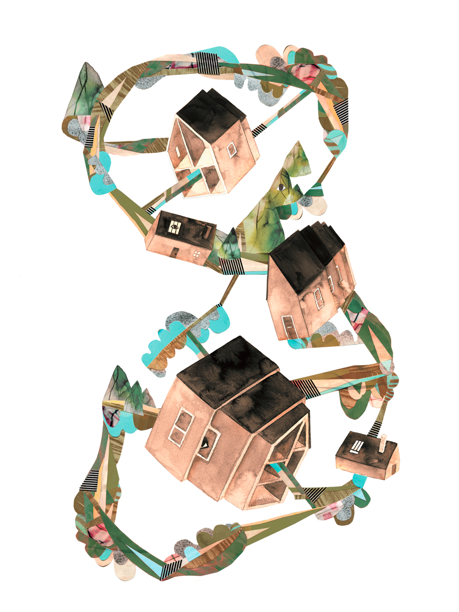
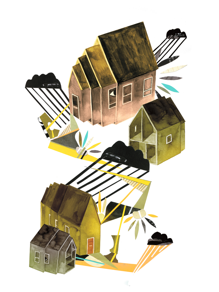
The illustrations of Vancouver-based artist Andrea Wan read like dreams, mystifying yet lucid. Her characters explore environments of the subconscious, seemingly suspended in a white void. The usual flow of time breaks up and objects take on a life of their own.
After graduating with a film degree from Emily Carr University, Andrea shifted her strong visual sense and love of storytelling to studying illustration and design at Designskolen Kolding in Denmark.
While exhibiting her fine art works at San Francisco’s Gallery Hijinks, Andrea has rocked editorial illustrations for a range of publications like Nylon, Montecristo Magazine and the Globe and Mail.
Q. Your personal work seems to draw heavily on the logic of dreams and the subconscious. We love some of the recurring images such as houses nested within each other like Russian dolls. Can you tell us a bit about the themes you address, and how you approach your personal work?
A. Houses has always been an ongoing subject of interest to me. I grew up in the suburbs where I spent most of my time until I moved out last year. In a place with urban sprawls and shopping malls everything seemed to have a recursive pattern.
There were very little interactions between people on the street as they are busy with their own lives. In the evenings, I used to take long walks alone in my neighbourhood, observing the houses and trying to imagine the lives of people inside by looking at clues from their lawns.
I often felt isolated while living in the suburbs and only wanted to stay home and draw. In my art I explored my response to the surrounding environment, integrating personal feelings with imagined landscapes.
Memories, the subconscious, and the anxieties in our everyday lives are some of the themes I’m interested in. I simply see my personal work as an outlet for my emotions and an on-going process of self discovery.
Q. After completing your degree in Film, Video and Integrated Media at Emily Carr University you went on to study illustration and design at Designskolen Kolding, in Denmark. What prompted the switch to illustration, and why choose to study in Denmark?
A. During my final year at Emily Carr, I worked on an animated film with a hand-drawn, illustrative look for my grad project. Some people asked if I have ever considered doing Illustration after watching my film. I didn’t have a concrete idea what I wanted to do but I was opened to trying new things.
At the same time I really needed a break from Vancouver to travel around and live somewhere else. Designskolen Kolding happened to be one of the few schools in Europe offered illustration and design courses in English, so I stayed and studied there for about 7 months after traveling around for a month.
Q. We love the prints “Untitled Collage” that you did with the Swedish creative team Rasterosett. Can you tell us how this collaboration came about, and how you approach working with other creatives?
A. I met Sandra, the co-founder of Rasterrosett, during my first year of Emily Carr while she was on exchange. We’ve worked on a few crazy and fun projects together for school and we’d always talked about collaborating on something on our own. During her latest visit in Vancouver we finally had a chance to do so.
Since we’re both inspired by the cityscape and the environment we decided to base our collaboration on that. She collected sources for the collage while I drew some things that came to mind in relation to the environment that surrounded us. It’s always a rewarding experience working with other creatives, combining two very different styles and work processes to create something new and unexpected.
Q. You’ve done beautiful commercial work for a number of big publications. Do you approach commissioned projects differently from personal work? What has been your most exciting project to work on so far?
A. I enjoyed working with art directors who are open-minded and those who would give me a certain amount of freedom in terms of how I conceptualize the subject. The process for commission works is usually more straight forward, I would keep the finished art work pretty close to my sketches.
Personal work allows a little more time for experimentation, and my work process varies depending on my mood. Sometimes I feel like drawing directly on the paper, other times I might fiddle around with colors and composition on my computer before I start.
Q. Given unlimited time and resources, what would be your “dream project”?
A. I’d love to collaborate with artists I like to create something for the public space in Vancouver, because I feel that’s what we’re lacking in the city.
Q. What are you working on right now? Anything coming up we can look forward to?
A. These days I’m trying to pick up painting again. Besides a few commissions I’m also working on some artwork for a potential solo show in the near future. I’ll keep you posted!
S&TM: We would like to thank Andrea Wan for making amazing work and taking the time to do this interview.
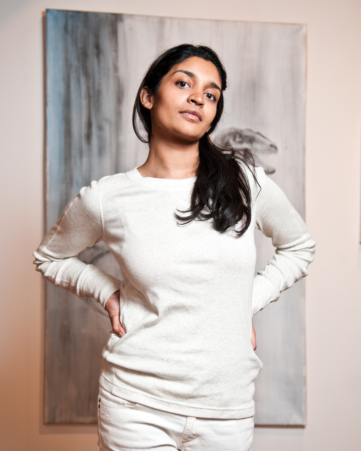
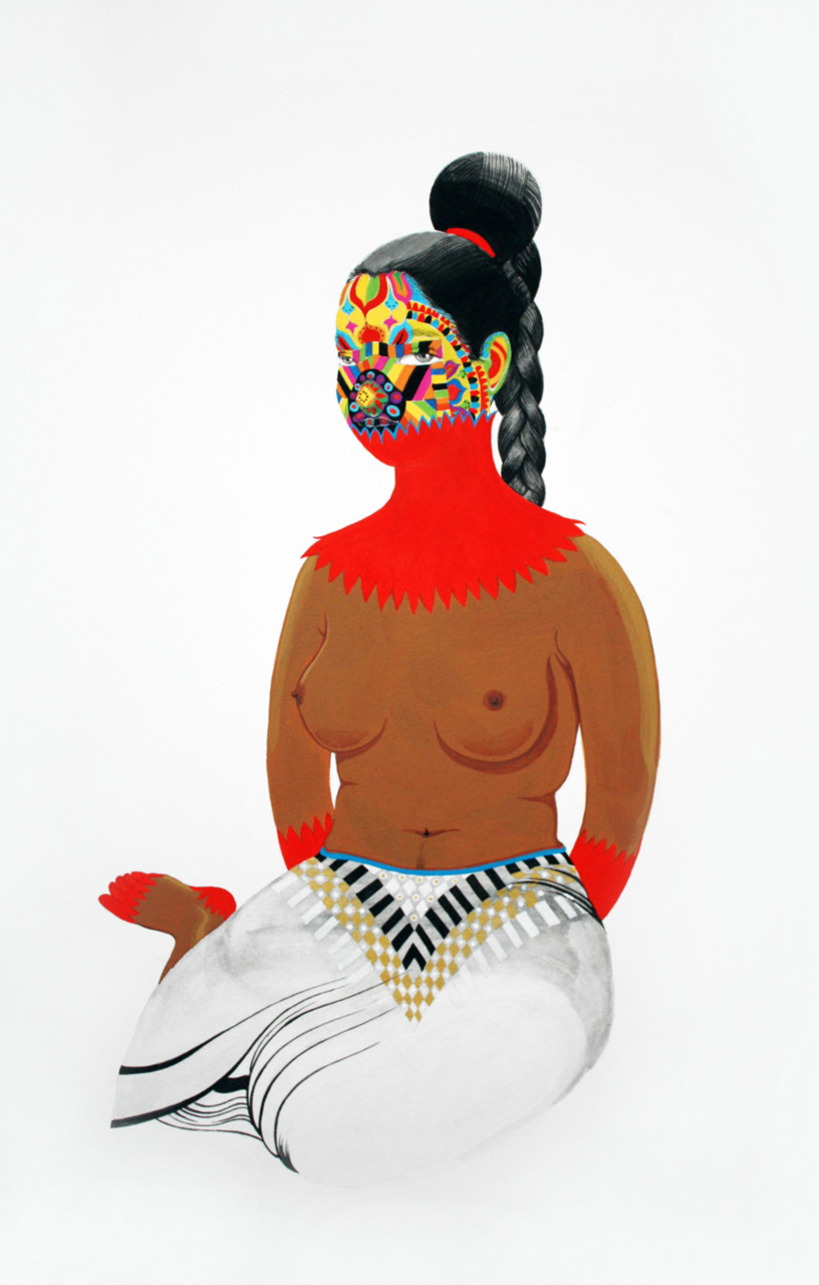
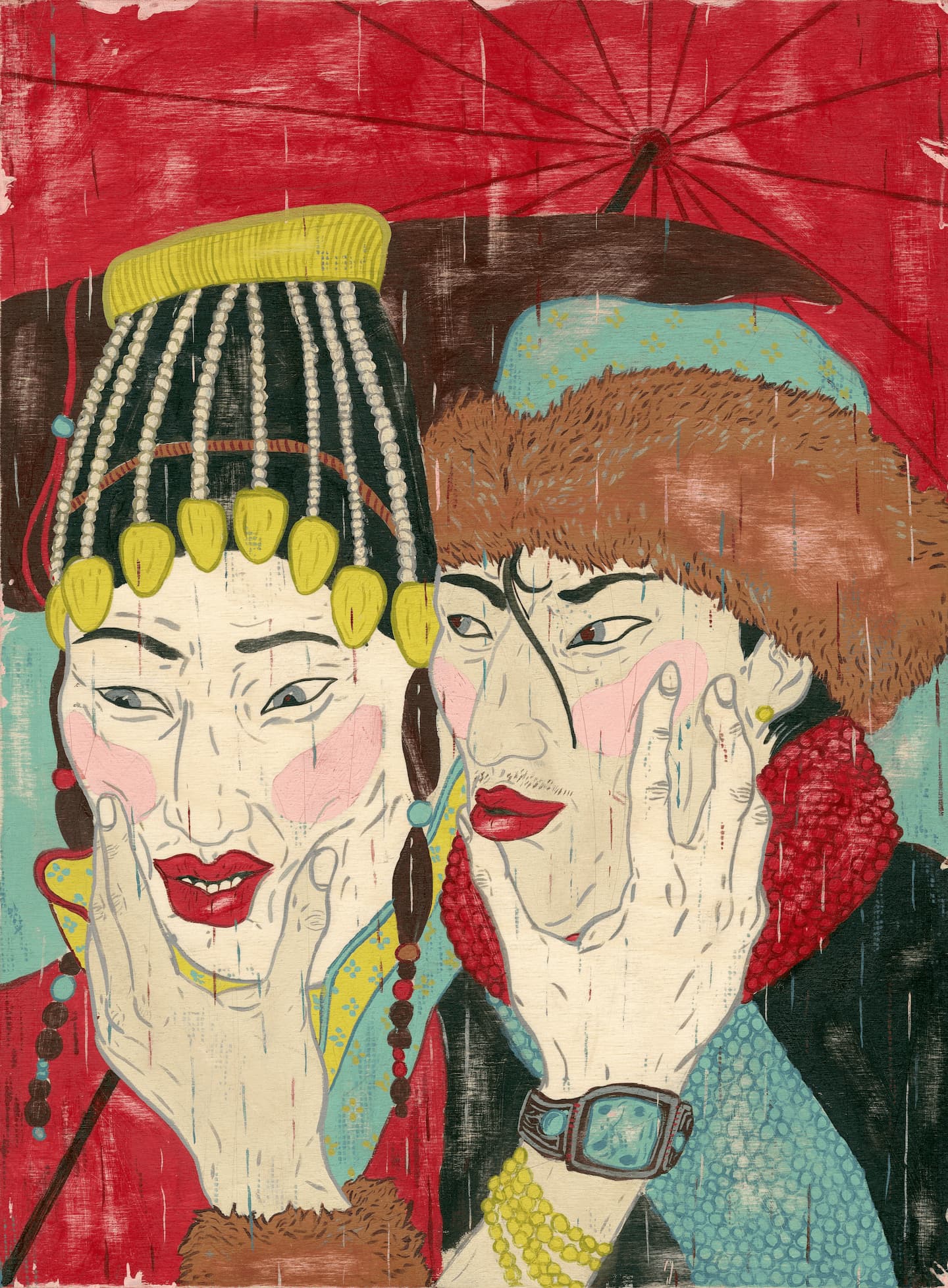
Just like the Russian doll in Matryoshka with Golden Panties, Rajni Perra’s paintings are all about the delight and dread of peeling back cross-culture layers of meaning. Her pop sensibilities, applied to traditional miniaturist style, work their way deep into the tangle of Eastern/Western culture and gender questions. While exploring heavy territory, there’s something undeniably weird and fun about Rajni’s work. Having recently been awarded the Drawing/Painting Medal for this year’s graduating class at OCADU, Rajni spoke with us about her latest series.
Q: Your work draws heavily on the imagery of traditional South-Asian art, yet seems to be playing with the modern influences eastern and western culture have had on each other. As a Sri-Lankan artist living and working in Toronto can you tell us about some of themes addressed in your paintings?
A: One thing that I like to address for sure is the intercourse of kitsch that goes on between Eastern and Western visual culture.
For instance, Bollywood is a response or re-appropriation of Hollywood to a certain degree, and then there are western parodies of it and so on.
Specifically what I like to discuss with the viewer is the visual treatment of the ethnic female body image. I’m not at all the first artist to talk about this in their work but I use a pop-ish, sort of subversive aesthetic to bring the issues of female ethno-sexuality in online or screen culture to light.
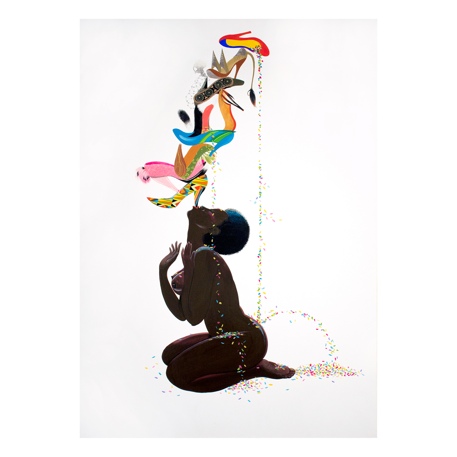
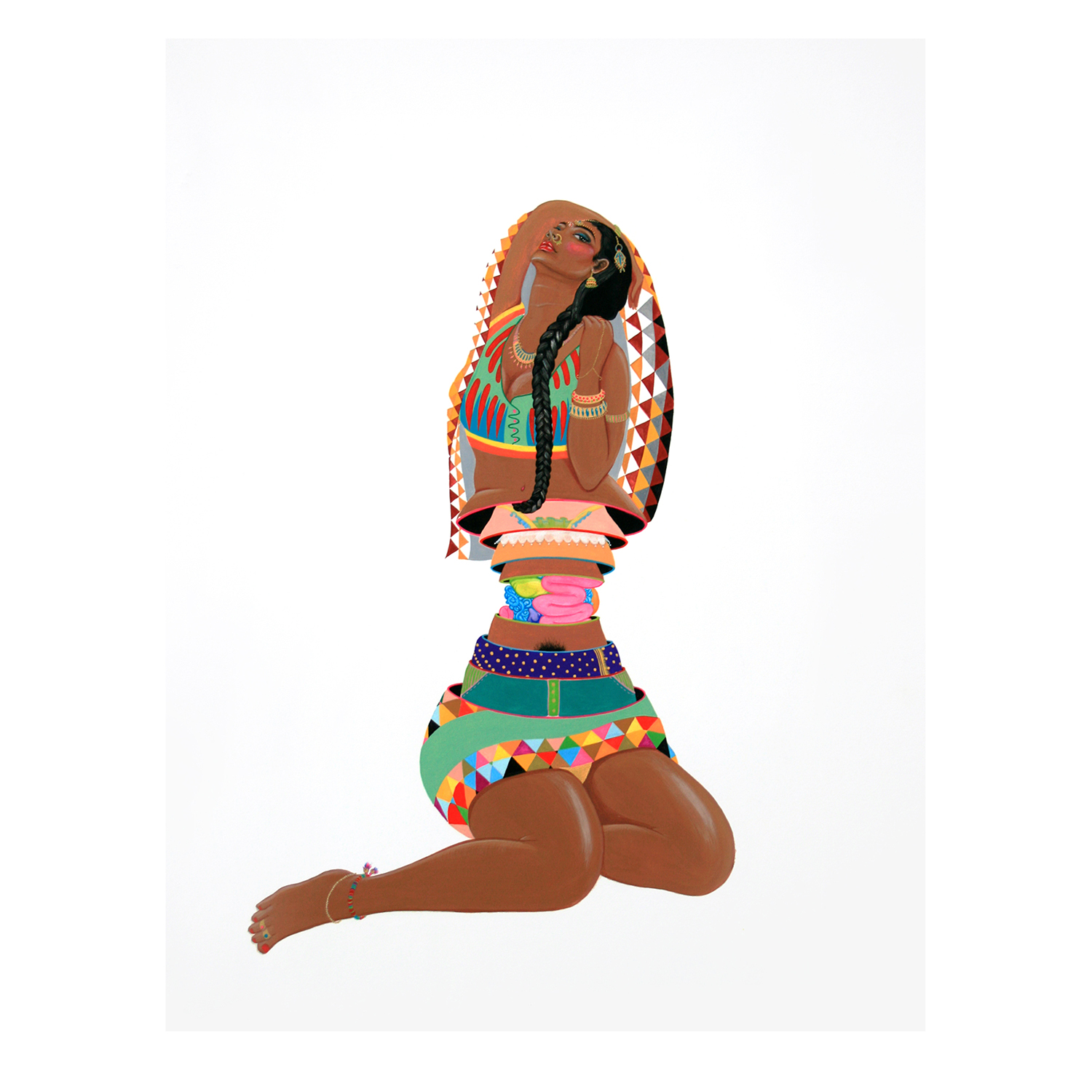
Q: Paintings like Chinnamasta and Matryoshka with Golden Panties examine representations of eastern women’s body image and sexual identity in both traditional and modern contexts. What are some of the ideas you’re exploring in these works?
A: Well, one thing I’ve had in mind for a while is the idea of the ethno-pornography site. Maybe this will help me to explain what I’m trying to do with my images.
We’ve all seen them- they’re these hyper-stereotypical web images of African girls in beads and wood, Japanese girls in kimonos, and Indian girls in saris; all very subservient, all very saleable; this is my point. There’s something for sale there.
I am trying to take that thing – the downward glance of the Caucasian male spectator – and turn it on its head. Or at least sideways.
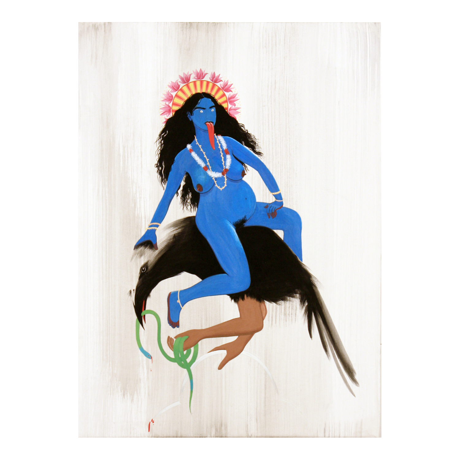
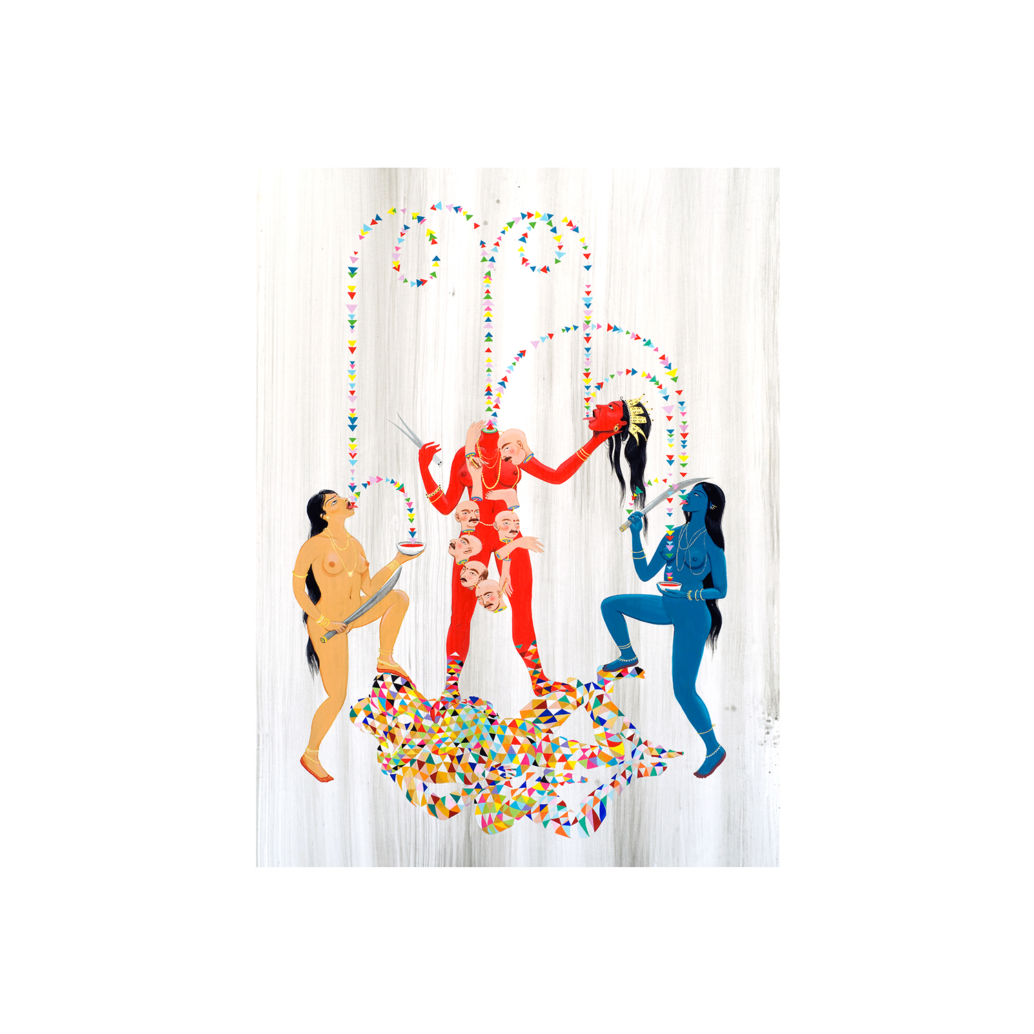
Q: The dinosaurs are a fun counterpoint to the religious iconography in your paintings. How did they find their way into your images?
A: I love dinosaurs. I don’t know. They’re just there and people really seem to like them, which makes me happy. People say they’re feministic, but I’m just having some fun and painting hot girls on these sort of phallic reptilian beasts.
I find they’re more about my love of style than anything else. This series is separate, it’s called The New Archeology. The others, concerning the East and idols, are called The New Ethnography.
Q: While your paintings reference eastern miniaturist style, can you tell us why they eschew the elaborate scenery leaving only figures on blank backgrounds?
A: My focus is on the treatment of the human body, as I explained before. Eschewing the background is also actually (or more so) an aesthetic decision. If I wanted to paint backgrounds I’d just be doing traditional miniaturism, I think.
Q: You recently graduated form the Ontario College of Art and Design. What (in the best of worlds) do you see yourself doing with your work in the coming months?
A: I’m continuing both series a little longer and then starting a new one. I have this one in the dino-series of an asian afro-lady riding two crocodiles. Im pretty excited about it. The new series will be in the same vein as The New Ethnography but will feature masks from my home country, which are pretty scary! And also things like food-sex and jewels and garlands of flowers.
Oh, and I plan to move around a lot more. But I do want to represent Toronto and show here and sell here. It’s my hood.
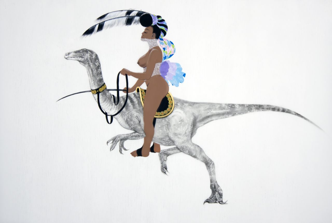
Photo by Eugen Sakhnenko
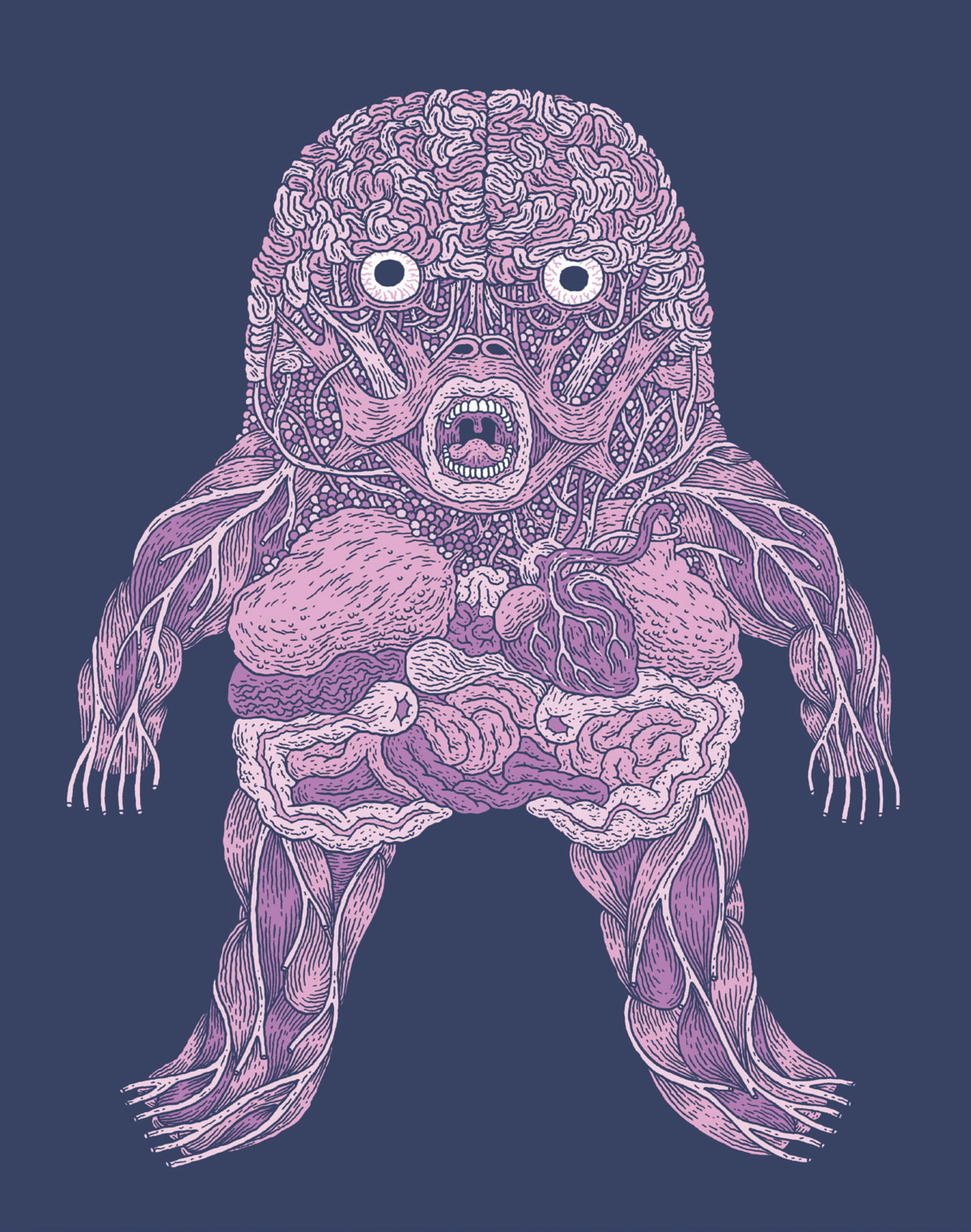
Ever get the feeling that your life, the universe, and everything are just a big cosmic snafu? That all the mesmerizing complexity of creation doesn’t make any more sense as you see the bigger picture? Anyone who’s ever pondered the meaning of existence through philosophy, religion, evolutionary theory, astrophysics, or reruns of Star Trek: The Next Generation will definitely enjoy By This Shall You Know Him.
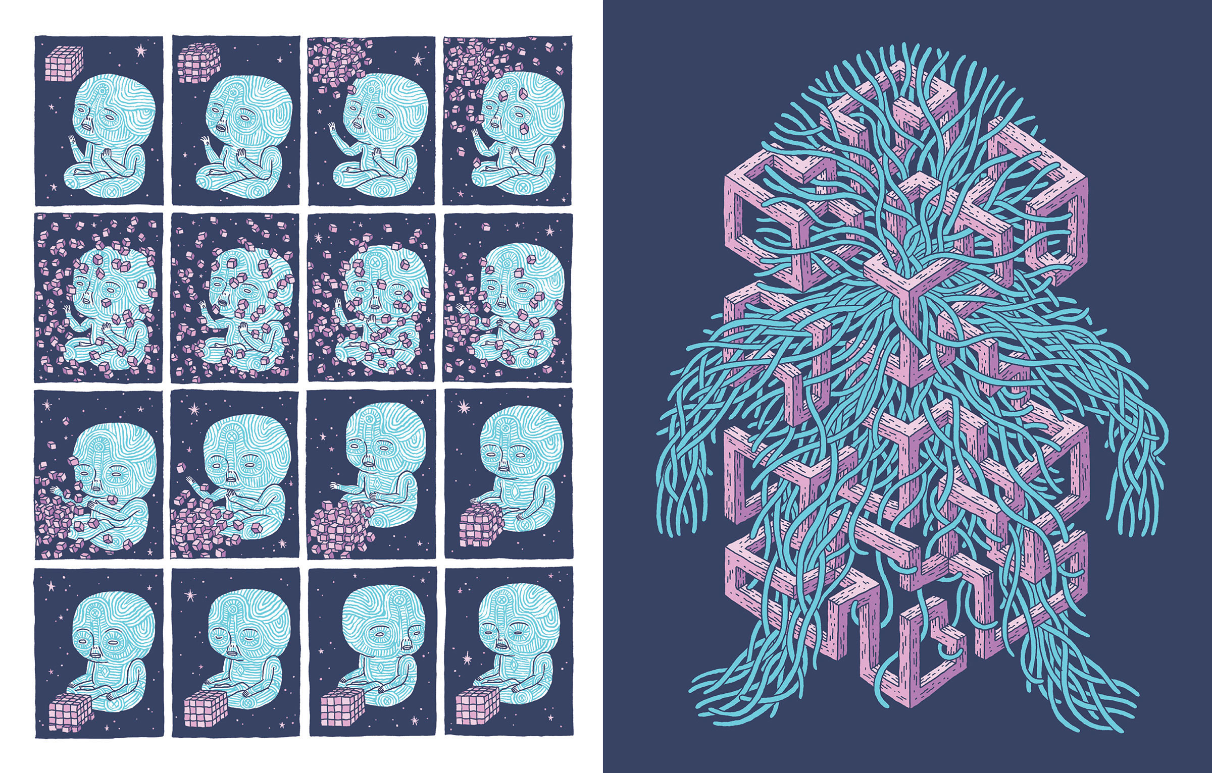
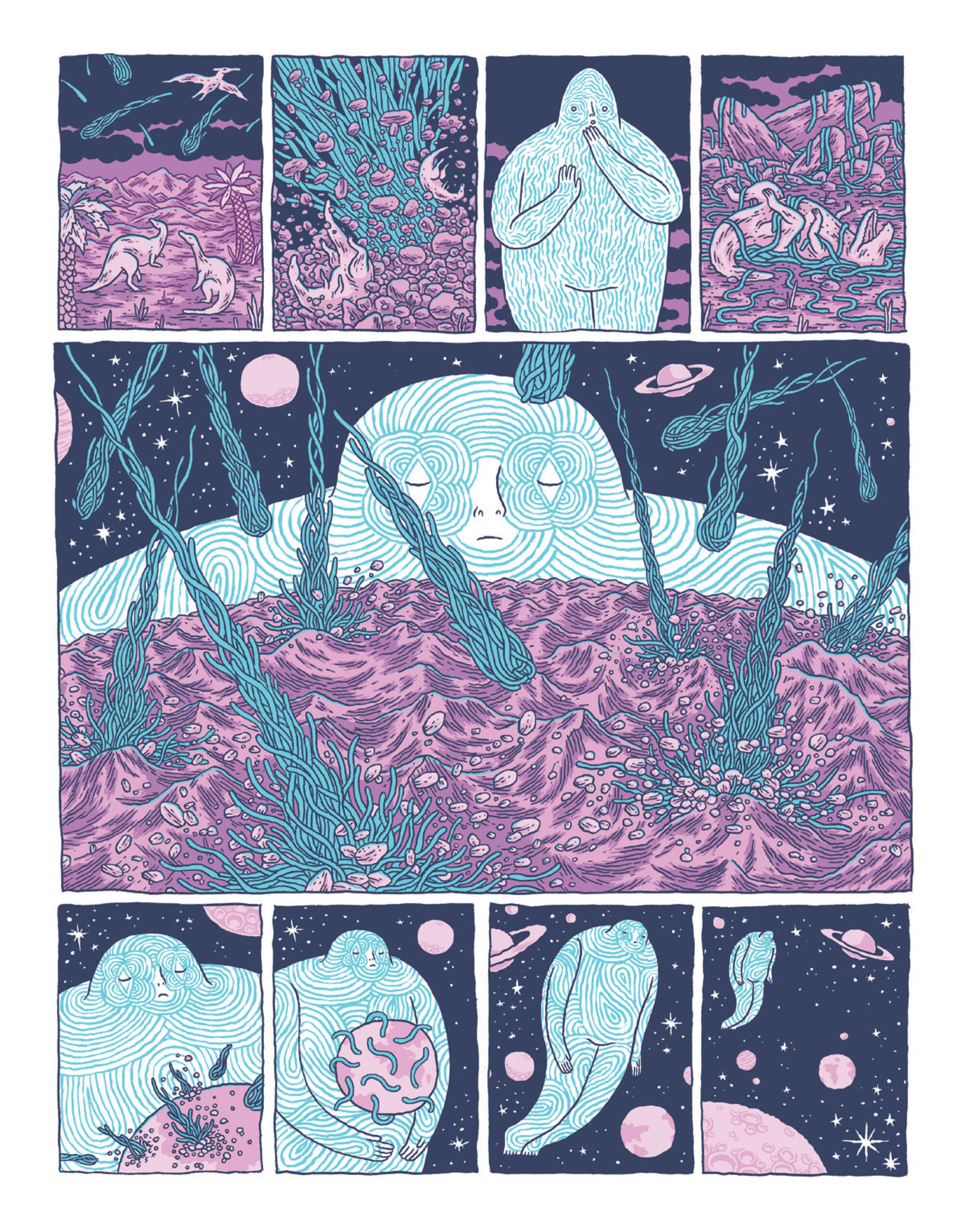
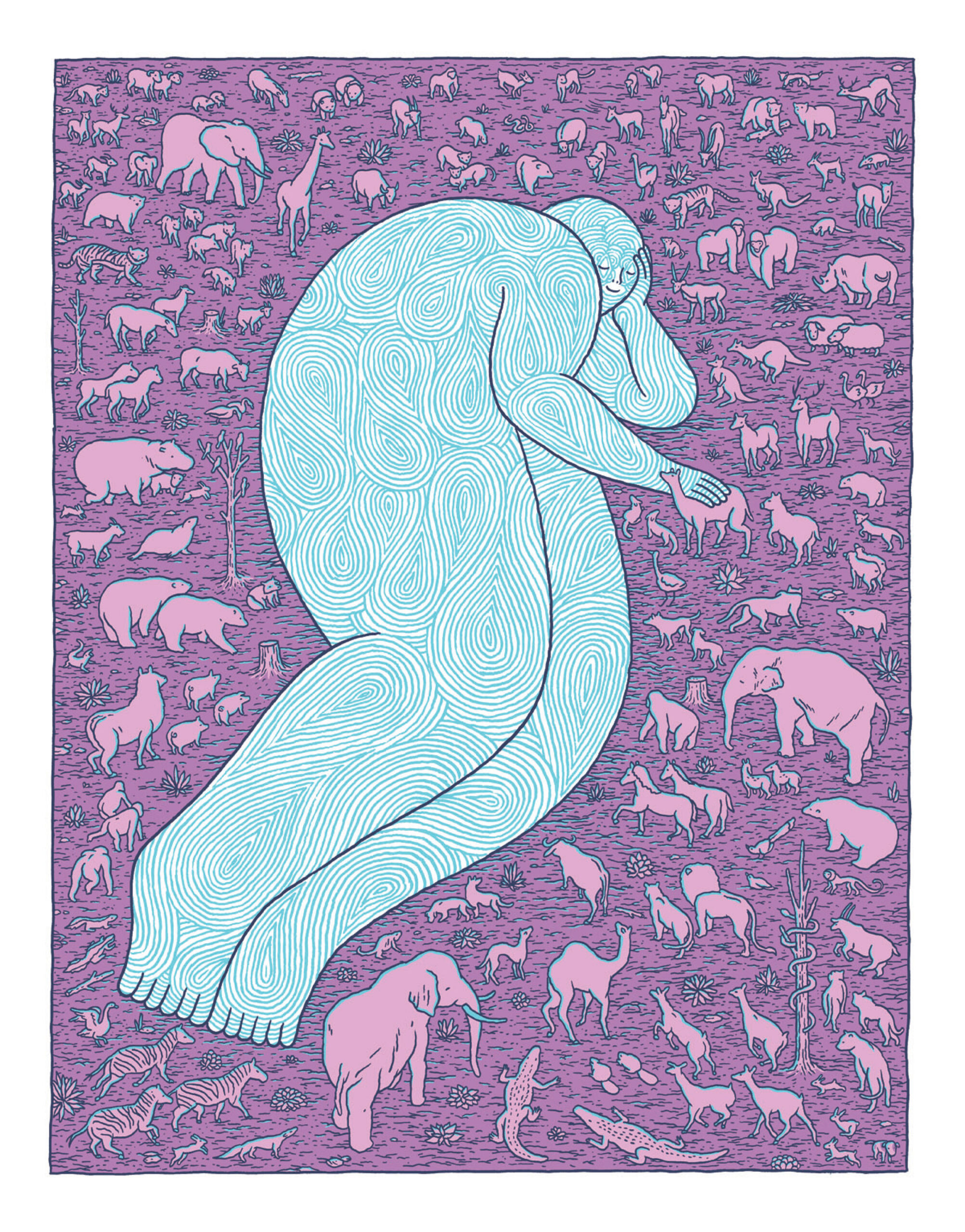
Written and drawn by the crazy-talented artist Jesse Jacobs, the story follows the birth of life, humanity, and good and evil, as the unintended side effects of a game of show and tell between squabbling, god-like celestial beings.
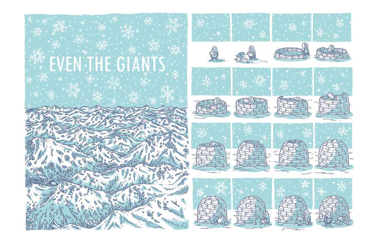
Much like his previous book Even The Giants, the story and art do double duty, at once profound, meditative, but also gross and funny.
Cleverly structured and beautifully rendered in 2-tone blue and purple, the larger book format really brings out the trippy detail in Jesse Jacobs’ artwork.
Q. Everything about this book is gargantuan! The story touches on everything from the nature of the cosmos, the origins of life and humanity, to the struggle between good and evil… Seems like you had a lot on your mind when you were writing this! You start the book with the Don Delillo quote “The spectacle of the unmattered atom.” What inspired this story?
Jesse Jacobs: I draw a lot of weird doodles on scraps of paper and in sketchbooks and I wanted to create a story that allowed me to freely showcase all of the random things that I most enjoy drawing. The idea of featuring characters that can conjure an infinite number of shapes and patterns and creatures meant that I could work pretty much anything I wanted to draw into the project. Initially I was intending to make more of an art book, with separate stand-alone drawings, but as the pages evolved I ended up working a lot of the random stuff together into a cohesive narrative. This comic is a collection of my drawings over the last year couched in a familiar creation-story.
My sketchbooks are full of a lot of my own writing along with stuff I hear on the radio, in podcasts, or read in books. When I was looking though it for ideas I saw that line about the unmattered atoms and drew it into the opening page. After a google search I saw I must have written it in there when I was reading Underworld, which I enjoyed all right but isn’t one of my top books or anything. I just think that line works really well with the overall sprawl of the story and imagery- just a bunch of weird stuff floating around.
Q. Lots of great creatures in this book! What are the 2-legged dog-like beasts called? Were they modelled after your dog?
Thanks. I really tried to balance the geometric shapes with looser more organic characters. Those dog guys were coming out a lot in my drawings. Where they came from and what they’re called I’m not exactly certain. I guess they’re just prehistoric dogs. I wish my dog had such strong hind legs as those guys. I did draw my dog in the comic but she’s really small and you wouldn’t know her to see her among all the other animals. I probably referenced Desmond when drawing those doggy creatures at some point, I’m sure.
Q. The tone of the title is fairly Judeo-Christian, but really the whole thing feels kind of Greco-Roman (where humans are the playthings of a rather dysfunctional family of very flawed celestial beings). Was it tricky blending the scienc-y perspective with the philosophical side of the story?
I won’t say some parts were not difficult, but the making of this comic was very enjoyable. Probably due to the lack of restrictions I had given myself. If a certain scene was becoming boring to draw, I would just move onto something else and return to it later. Like the blending of the animal and nature drawings with the geometric shapes and patterns, the story itself is kind of an assortment of a few approaches. The celestial beings are so different from the early humans that it was almost like drawing two different stories. Generally I had a lot of fun drawing all the stuff. I had the loose idea for the story, and from there the drawings guided much of it.
Q. 88 pages is huge! How long was the whole process of making this book end to end? (We feel like we saw some of the art for this a year ago at the last TCAF). Will you be taking a vacation, or are you already onto your next endeavour?
I started drawing it a little over a year ago, and you did see that screen print I did last year, featuring that weird wormy character encased in the chamber. That was one of the first images I made for the comic, and that thing pops up throughout the book. That character takes longer to draw than any other, and that says a lot because most of them took a long time. All the patterns on the beings are hand drawn, which was time-consuming but satisfying to do. I picture those blue patterns flowing and moving on their “skin”, kind of like Rorschach’s mask. So I guess it took me about a year to complete, though I had huge breaks where I did other stuff as well. There were times when the narrative kind of slid away and I edited a lot of pages out of the book that afterwards seemed unnecessary. Anne Koyama was a big asset in helping with the editing.
I’ve been thinking about and sketching another comic that is still in its early stages. I’ve also got a few other small projects on the go. It’s gardening season so we’re getting into that now. It’s always easier to be productive in the winter, I find. Koyama is bringing me to CAKE (Chicago Alternative Comics Expo) next month and I’m looking forward to that.
Q. The book will be launching this weekend at TCAF! What are you most looking forward to at this year’s event? What other Jesse Jacobs goodies can we snag at your table?
I’m really excited that Gabriella Giandelli will be in attendance, and I plan on catching her retrospective exhibit. I love her comics so much.
I wish I could say I had a bunch of stuff to sell, but this year I’m really just focusing on the book. I’m actually in the middle of doing some more skateboards with Homegrown, with imagery loosely based from By This Shall You Know Him. They will be finished for CAKE, and I’ll make sure to hang onto a print for you guys.
S&TM: Huge, huge thanks to Jesse Jacobs for taking the time to do this on the eve of TCAF!
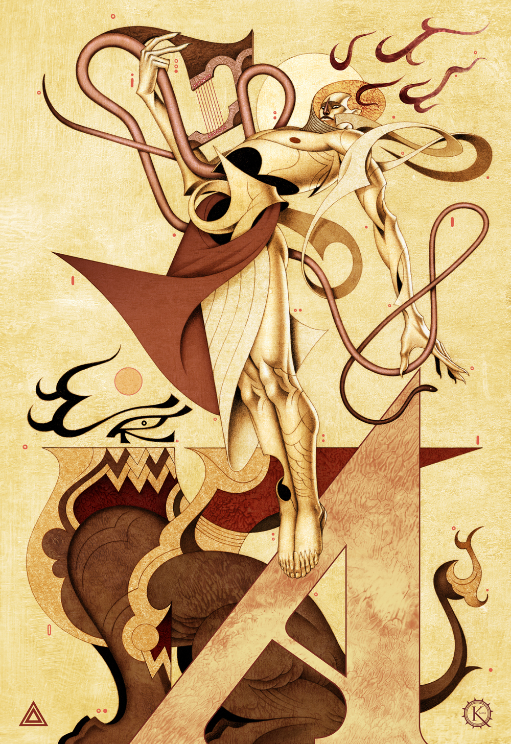
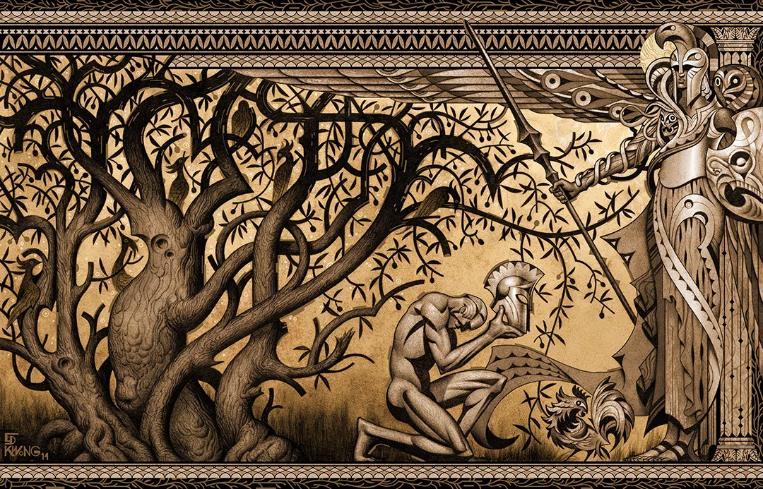
Montreal-based illustrator Edward Kwong proudly mines the gamut of art movements of the first half of the 20th century to create images both familiar and strikingly new. His graphic approach is a mashup of Art Deco, Futurism, German Expressionism, crossed with the urgency of comic book art and bold typography.
His portraits of Greek gods in his “Mythos” project are rendered in a style that feels like something between Art Nouveau and Deco, but are intimate and original re-interpretations of the age old themes.
We caught up with Edward Kwong to talk about his inspiration and work in the upcoming Anthology Project Volume 2.
Your art has a strong current of Art Deco styling to it. What is it about the art and design from that period that inspires you? What are some of your other influences?
There’s always been something strangely timeless for me about the ’20s and ’30s that I’ve always been fond of, whether being its music, its fashion, architecture, or its art and design; those decades stick out in my mind as having a particular sense of audaciousness and modern elegance that I admire, both aesthetically and in terms of creative spirit.
That coupled with the fact that Art Deco incorporates other design styles and movements (Neoclassical sculpture and architecture, Cubist painting, Constructivist poster design) that have influenced my work in one way or another over the years, will give you a good indication as to why I have an inclination towards the style.
Those decades stick out in my mind as having a particular sense of audaciousness and modern elegance that I admire, both aesthetically and in terms of creative spirit.
We love the images from your Mythos Project, which you descried as “A compendium of reinterpretations of the Greek Pantheon”. Can you tell us about what prompted this series and what you draws you to Greek mythology as source material?
The Mythos Project started out of a desire to step as far away from the classical representations of the Greek pantheon, and a choice to skew the image that I think most people in western culture have in their minds when they think of what say Zeus or Poseidon look like.
There’s so much symbolism and richness to each myth that it provides a plethora of ways to mold each character to whatever fashion I see fit, to extrapolate my interpretation of their characters. I suppose it’s my way, through art, of further appropriating the myth of those who have been adopted before. Just as the Romans gave Greek gods new names, I’ll try to give them new faces for modern times and for “posterity’s sake”, as a good friend of my mine so often says.
Furthermore, I’m fond of the notion of deities, as seemingly all wise and powerful as they are, having the propensity to be as emotional and petty as humans. Where else, but in Greek mythology do you find gods who routinely meddle in earthly affairs for their own whims, that sleep around and throw tantrums when they don’t get what they want? Olympus, that’s where.
What were some of your favourite projects to work on and why?
I find it hard to pick favourites among my past projects, or rather, I can’t say if I have one. I try as much as possible to enjoy an aspect of creation from each and every one. Some more, some less. It’s always nice to have projects that invite me to push myself as far as possible and encourage me to take risks creatively.
More often than not, personal projects excite me more so than commercial work. All the better if whatever I happen to be working on manages to make me feel nostalgic or bring me back to that feeling of unbridled awesomeness you get when you’re a kid drawing something you love, and the world your focused in makes utter sense. That’s a great feeling to be reminded of.
You now live and work in Montreal after having schooled at the Alberta College of Art and Design in Calgary. What drew you to Montreal? Can you tell us about the art scene there?
I moved here for family, good friends and a change of cultural flavor, compared to Vancouver where I lived after graduation. I actually wanted to move to New York initially, but those plans didn’t work out as I had hoped; Montreal was close and about the most foreign major city in Canada that I could think of to move to.
There seems to be a healthy appreciation and a community for the arts here relative to other Canadian cities I’ve lived in. I’m not particularly involved in it, but there’s no shortage of art exhibits to see from established and new artists on a regular basis. I wish I could say more, but I haven’t lived in Montreal all that long.
Given unlimited time and resources, what would be your “dream project”?
I’d love to have the opportunity to create thorough book collections of illustrated mythologies from around the world, printed up nice and big and real thick.
Or Better yet, fill a large space with massive murals, sculptures and installations to tell the tales of various world mythologies in order for people to experience my work on a grand scale. That would be cherry indeed.
S&TM: We’d like to thank Edward Kwong for taking the time to do this interview and for contributing the beautiful header artwork!
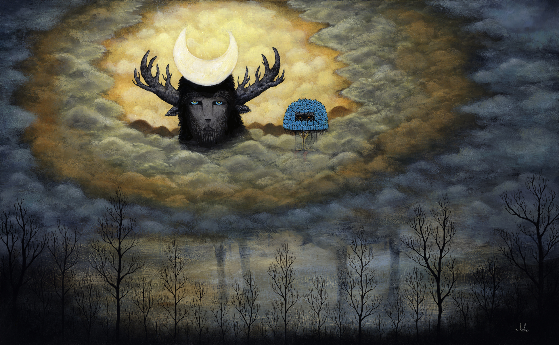
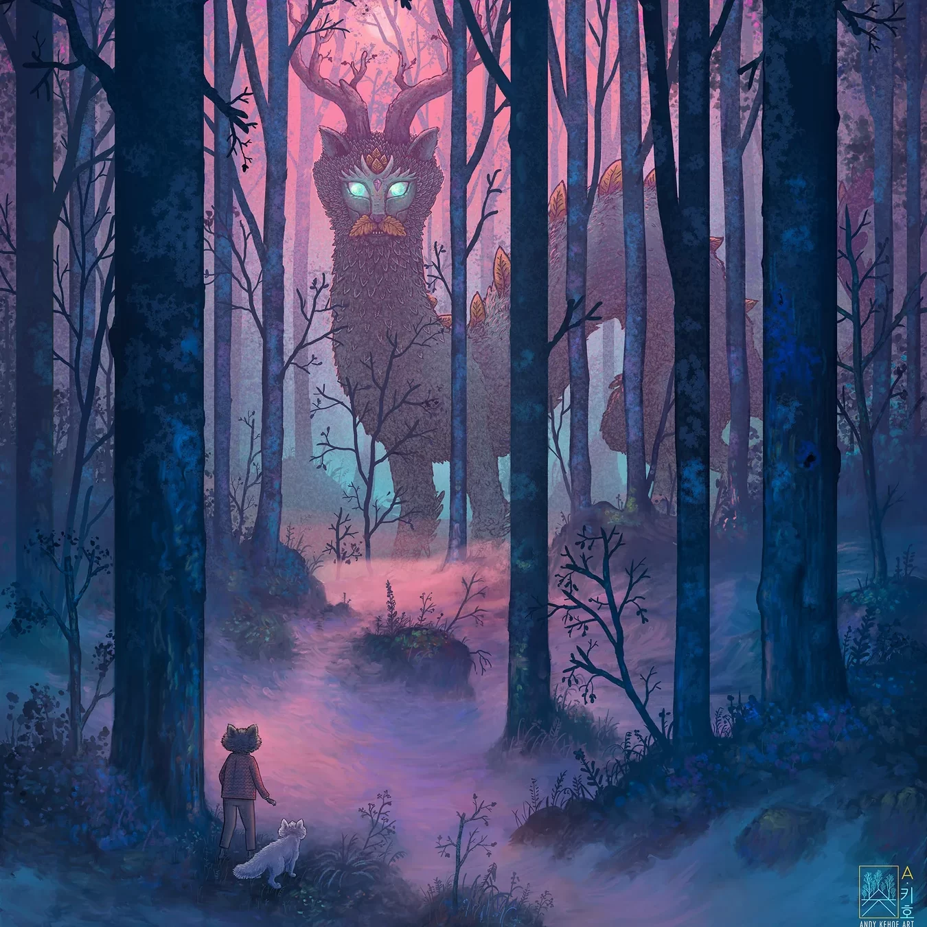
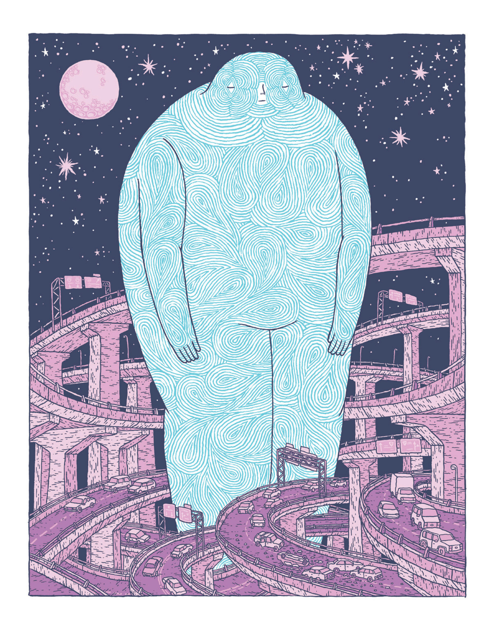
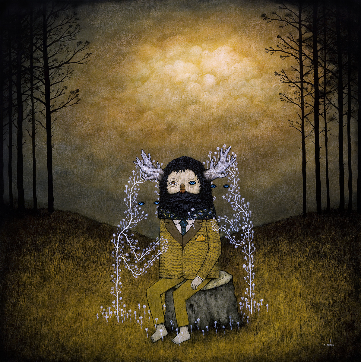
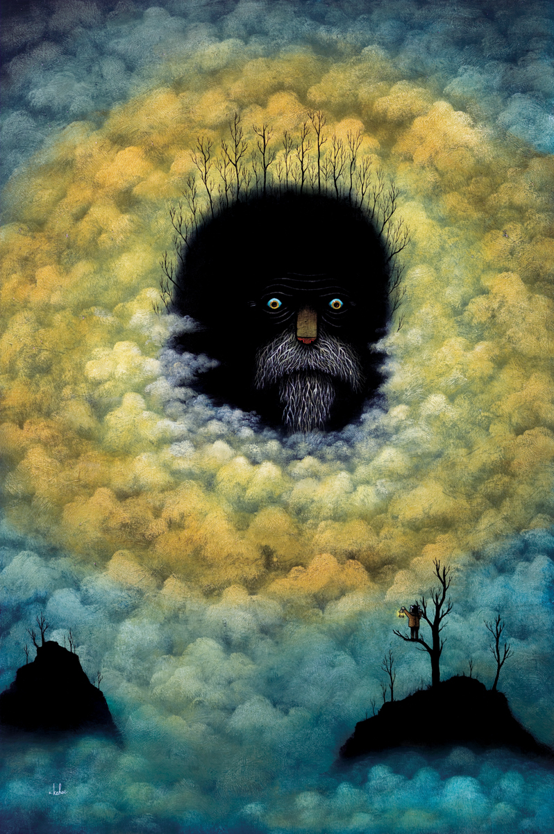
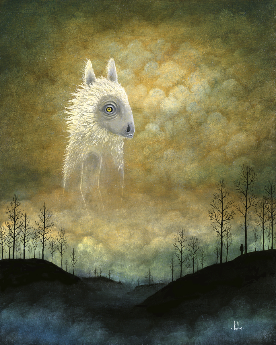
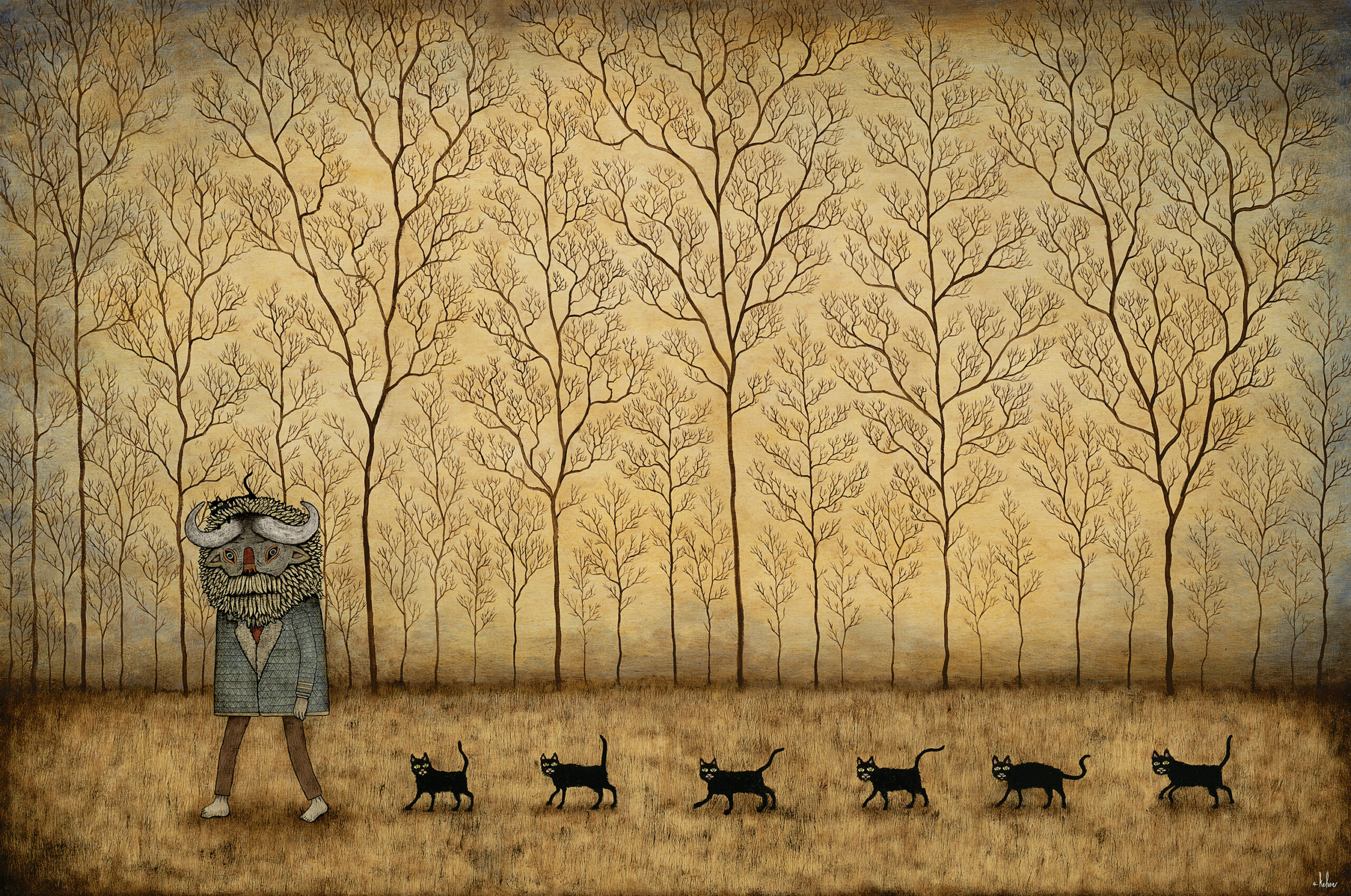
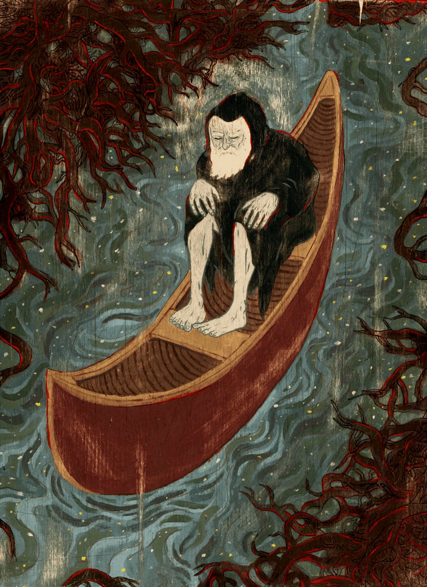
The characters in Andy Kehoe’s paintings inhabit a place frozen between the last golden days of autumn and the coming dead of winter. Similarly, their lives seem stuck between some previous idyllic period where nature was untamed, and the encroaching trappings of civilization. For his upcoming show at Jonathan Levine Gallery in New York, the Pittsburgh-based painter continues to evolve his complex, wild and melancholy world.
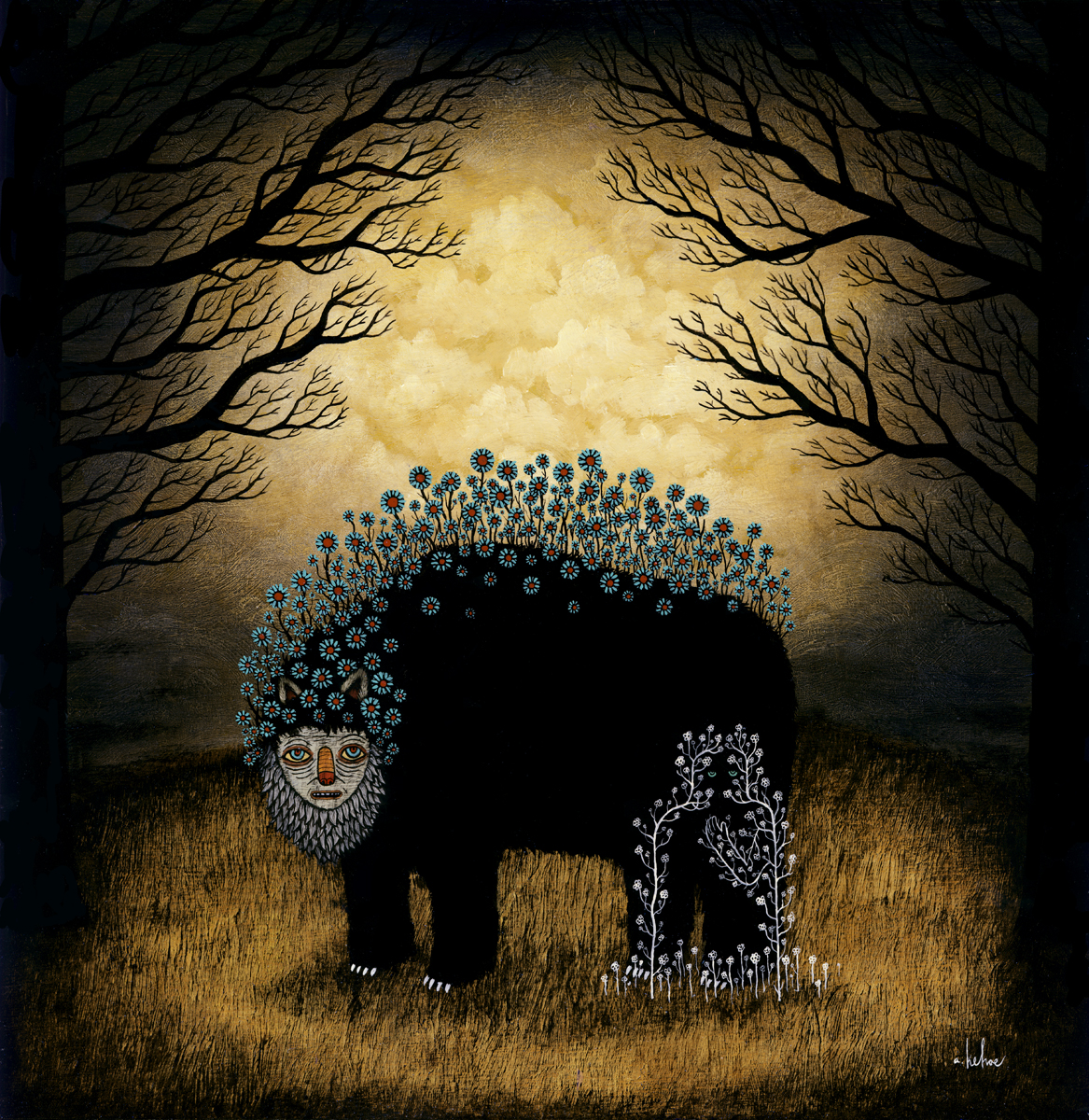
We’ve come to love many of the characters in your paintings (in particular the one made of spectral white vines and disembodied blue eyes, and the man wearing a helmet of blue leaves). Are the re-occurring scenes and people in your paintings a way of telling some on-going larger story?
There is definitely an overarching story going on, but it’s mostly day to day tales of strange characters in a strange world. I like feeling like a silent observer visiting an unknown, bizarre land and watching these characters from afar while chronicling their activities. There are certainly some characters that come to the forefront.
The spectral flower vines are some of the spirits that wander around. There is a whole spirit world that exists closely with the living world.
The veil separating the two is pretty thin, so there are regular encounters between the living and spirit world. Some of the more magical creatures live freely in both.
The blue-headed character is kind of a strange case. He’s a sort of weed and parasite that touches trees and takes them over to produce more blue leaves. His blue leaves have become valuable and often used as currency so he’s been kind of pulled into the civilized world. There are tales behind a lot of the characters. Hopefully I find a way to tell them all one day.
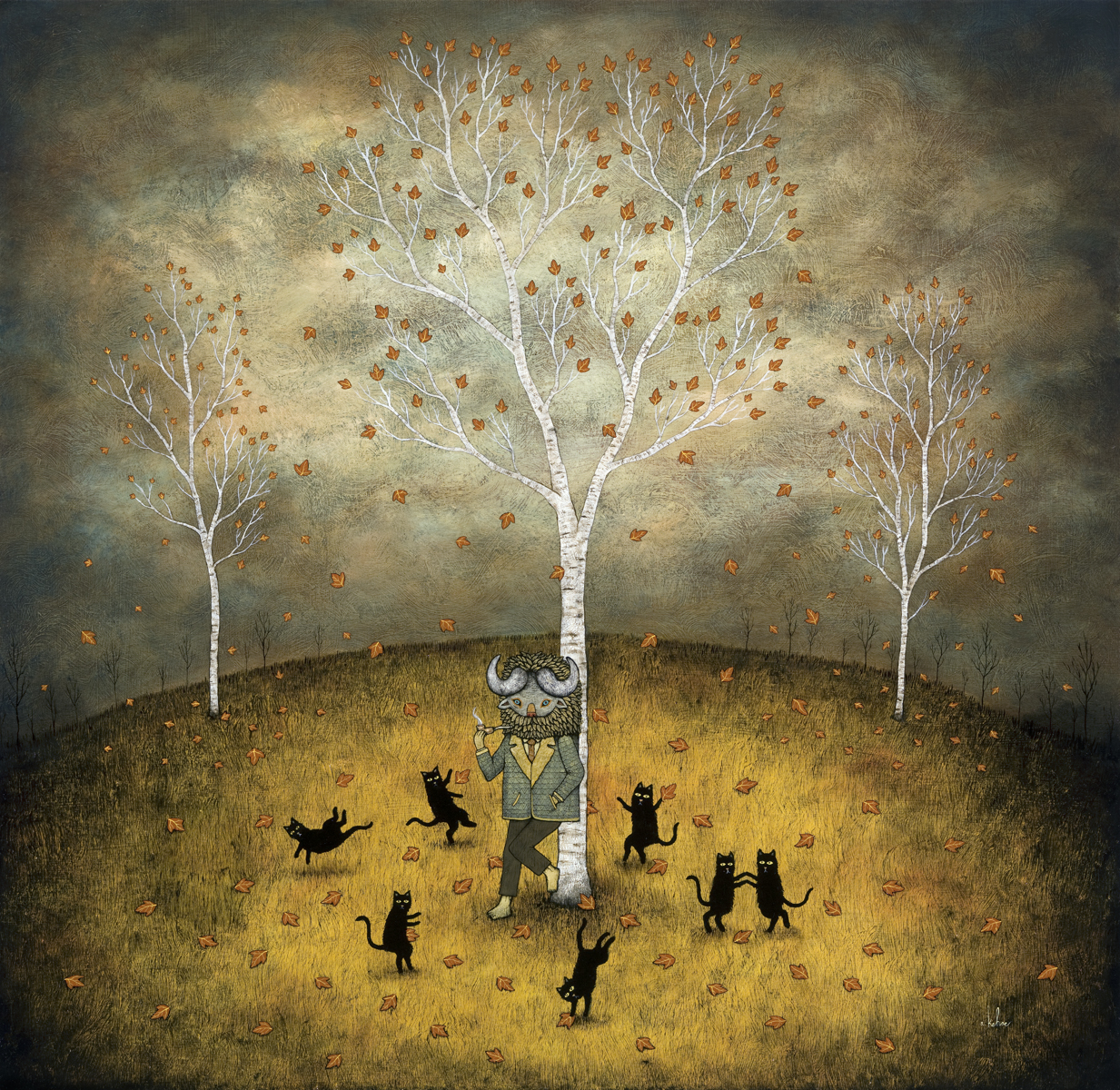
Can you tell us why some of the animals in your paintings are wearing suits, scarves, sweaters? Have they spent time in civilization?
There is more civilized part of the land that’s more practical… well, as practical as they can be I guess. They have things like clothes, leaders, laws and taxes and a lot of the bullshit we have to deal with everyday. There are also creatures that reside mostly in the forest and some outlying islands that live wildly and are more steeped in magic and nature.
You have a big solo show coming up this March at Jonathan Levine Gallery in New York. Do you have any special regimen for preparing for a show? Where did the idea for the show title “Strange Wanderings” come from?
I usually start my larger and more involved pieces first so I can work on them through out the first couple months or so. I use mostly oil paint so I have to plan out which paintings will take the longest and which paintings I can start later. Starting a show is always tough with all the planning that is involved and it’s definitely my least favorite part. Slow going. The first couple weeks are filled with priming wood, sketching, laying out and underpainting. Once I get going, I usually work on at least 6-8 paintings at one time. That way I always have a painting to work on while others are drying. I like it this way especially when I get deep into the paintings. Then I get into the details and everyday is a new journey and a new problem to solve. It’s exciting to see something you’ve been working on for months finally coming to life.
“Strange Wanderings” came from my move back to my hometown of Pittsburgh,PA from Portland, OR. My brother Ben, my mom and my grandma met me in Portland and we did a cross country trip and got to see Grand Teton, Yellowstone, Devil’s Tower and the Badlands. It was a little overwhelming to see all that beauty on such a grand scale. I was endlessly inspired by everything I was seeing but another part of me was totally intimidated. As I was looking at all these natural wonders, I kept thinking, “How the hell can I compete with this? Nothing I can ever make will ever top this.” So a lot of the show deals with characters and creatures taking journeys and dealing with things larger than themselves and searching for where they fit in.
Your brother Ben Kehoe is an awesome artist as well. Do you influence each other? Any healthy competition?
I don’t know if we influence each other directly, but being twins, we definitely have a lot of the same influences by just growing up together. We’ve spent the better parts of our lives around each other so I’m sure a lot of themes exist in both our works. We aren’t competitive with each other at all. Even in other aspects, we usually avoid competing against each other because things will might get heated and we usually just feel bad for the one that lost. Haha. Yeah, it’s weird. Being on the same team is always much more fun. In that respect, we try to help each other out as much as possible when it comes to artwork. I wish him as much success as possible.
If you weren’t a painter, in an alternate universe you’d be …
hockey player/crime fighter/playboy
What are you most looking forward to this year?
Of course, I’m looking forward to my shows coming up this year. I’ve got the Jonathan LeVine show in March and my first show with Roq La Rue in October. Amazing year for shows! I’ll be taking a road trip in between to do a couple weeks of camping which should be awesome.
S&TM: Many thanks to Andy Kehoe for taking time out of his preparation for his upcoming show at Jonathan LeVine Gallery do this interview.
All images © 2011 Andy Kehoe.
The woolly and wildly expressive style of Toronto artist Sean Lewis hearkens back to frenetic and lawless history of the taming of the American continent. While completing his thesis year in illustration at OCADU in Toronto, Lewis has already carved out a unique body of work, and is currently involved in Cavalcade, a collaborative group mural project at Xpace in Toronto. With a new series in the works for his thesis, Lewis discusses his learning experiences and plans for after graduation.
Your body of work is really inspiring, even more so considering you’re still in school. How has your university experience influenced your growth as an artist, and do you have any specific direction planned for after you graduate?
Not to sound like I’m plugging the school or anything, because I know a lot of people haven’t had the best experiences with it, but my time at OCAD has really changed my outlook on art making and has many ways rejuvenated my passion in it.
The professors particularly in the illustration department really pushed me to try my hardest. After a few embarrassing critiques in second year, I kinda started to clue into what made an exciting picture. I started to constantly compare my work to art I loved being published in books, and fawned over in art galleries, and just try to meet (and ideally surpass, but yeah right) that quality.
A fellow student pretty much taught me how to paint because I had never done it before. So I shifted my work out of the computer and started to get more excited about the results.
As for the direction I hope to head in after I graduate, I just aim to to spread out a bit and experiment more with other mediums and visual motifs. I don’t know why but I always feel a little embarrassed when people ask my medium and I say acrylics. I rarely find work I’m excited about when it’s done with them so I spend a lot of time making sure they don’t look too acrylic-y.
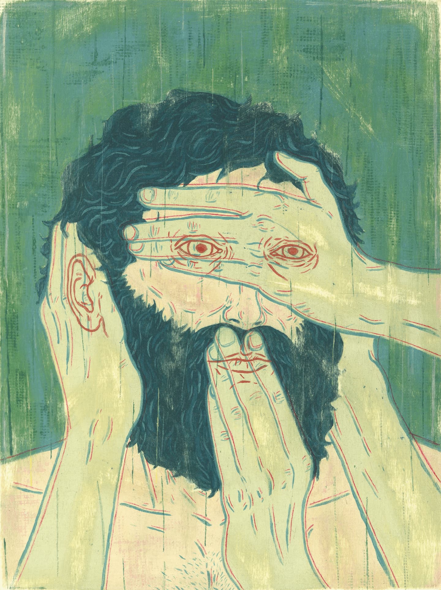
We’ve noted a recurring “beard” motif in your illustrations. Could you tell us about some of the themes you explore in your work?
I always get teased about the beards/hairs/pubes in my paintings by my friends. I tend to focus on that sort of imagery because it really set people and the concept outside of time and I felt it helped create a timeless looking picture. I felt a little bummed when I saw it become sort of a trend in a lot of peoples work so I’ve made a conscious effort to try and stop doing it but clearly I haven’t really.
I have a huge obsession with the past, particularly the rise of America and all the awful things that have happened over here. The steady destruction of the wildlife, and feeling like everything you do in your day to day life destroys what supports us, makes me feel increasingly sad and conflicted about what I should be doing. At times I feel like making art is indulgent and I should be involved in causes that have more impact. So I’m trying to shift my work in a way where I convey issues I’m passionate about.
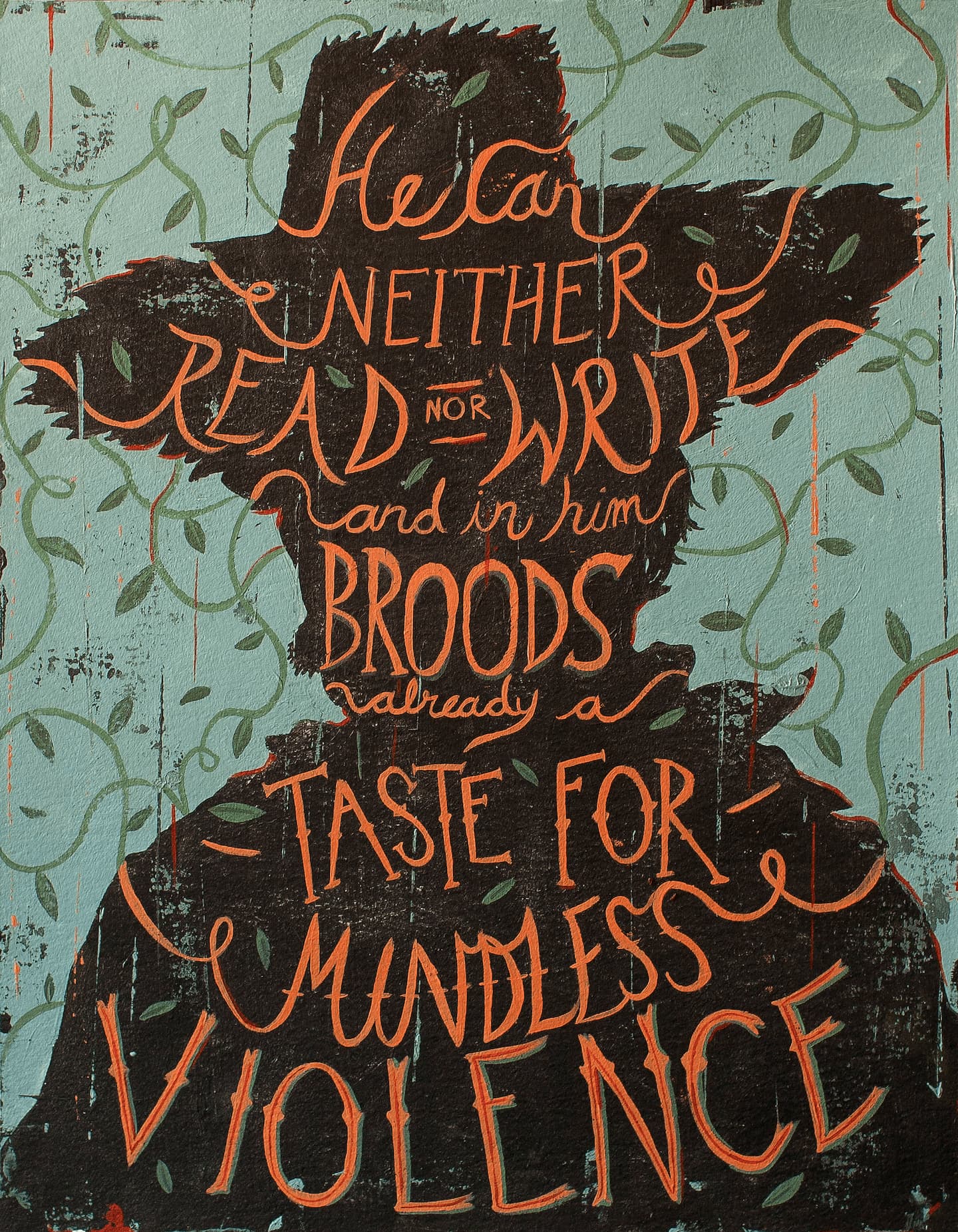
Much of your work, such as the cover for Blood Meridian, involves some hand rendered typography. Are you working towards a specific design aesthetic, or do approach each illustration individually?
I’ve been taking stabs at hand rendered typography because I love the way it can look. And it’s really fun and satisfying to do. I also love the way pictures look in design contexts. Doing the Blood Meridian cover in my own time was a nice little exercise to see how one of my images would look in the place of a book cover. Going to a record or book store is so fun to just look at the packaging. I get so pumped when I see a beautiful design and how multiple images can come together to create a beautiful cohesive thing. I see it much how an album is compiled – songs fit together in certain ways and in a lot of cases totally enhance the feeling and power of a song through its sequencing.
Looking at a record cover, and the back, and then flipping it open can be a similarly breathtaking experience in how each image can add to another ones power.
I definitely aim to develop a pretty specific design aesthetic so hopefully someone will always recognize my work as only my own.I use recurring design elements and textures that I hope make my images cohesive but at the same time I want every painting to carry its own weight and stand strongly on its own.
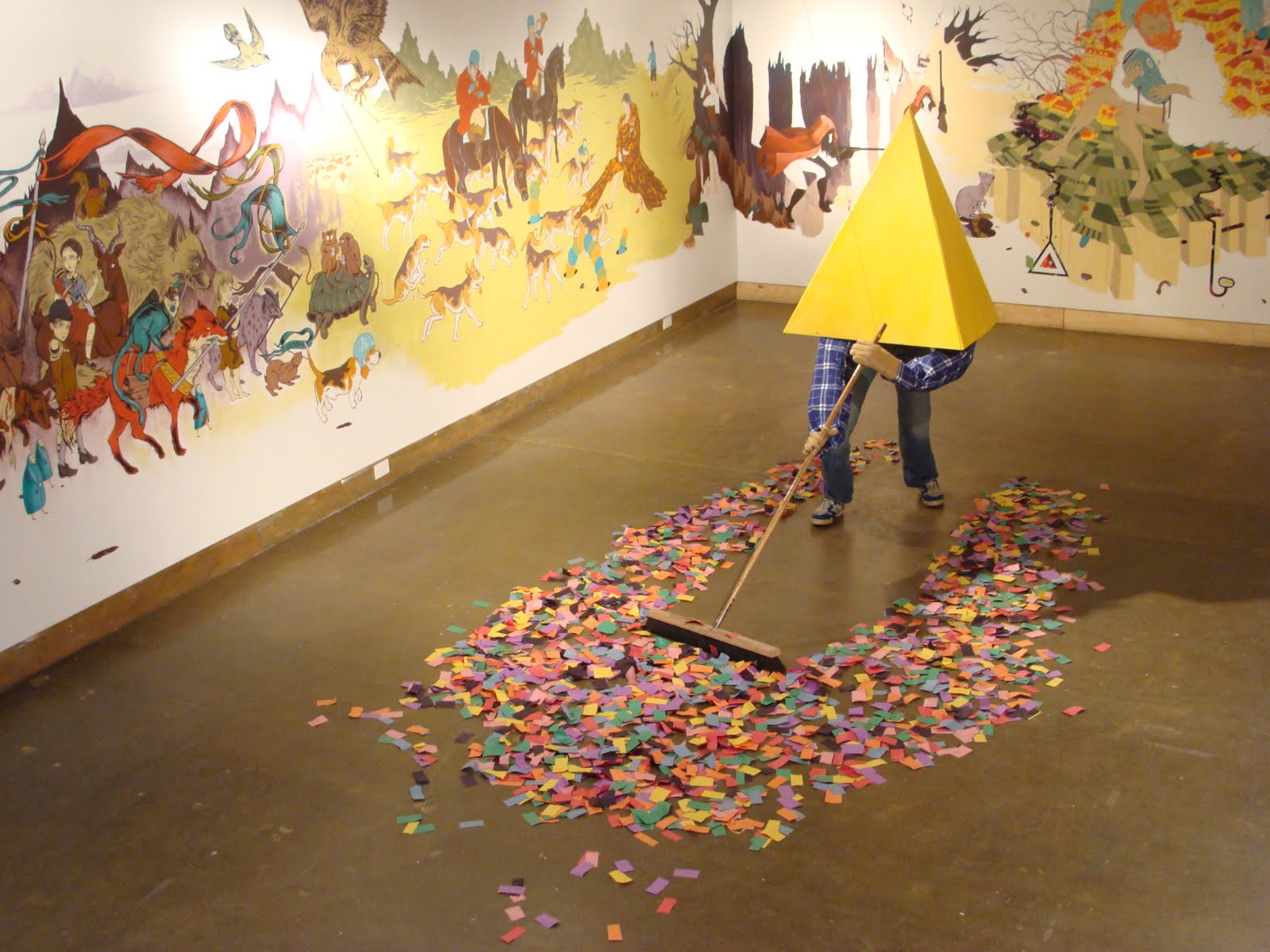
We love the concept for the 360º collaborative mural for the group show at xpace you’re participating in. Can you tell us about the idea behind this project and what it’s like collaborating with the artists involved?
This was really fun and stressful to do, and all the credit must go to the very hard work of Jessie Durham and Dmitry Bondarenko who basically got everyone all together and organized the whole thing.
The shows theme was basically set around the idea of a procession and it’s called Cavalcade. Everyone got their own section of the wall and we spent a lot of time figuring out who would be beside who, and how everything would fit together. I was really happy that I got to collaborate with my good friend Adrian Forrow, and be a part of a show with so many talented folk! We all planned to have our set spots and leave space between each person’s mural for a fully collaborative section that eases the viewer into the next person’s work.
I pretty much planned from the get go that Adrian would be introducing his characters into my own mural heavily. But now everyone is in a place where we can really improvise and find neat and exciting ways to add our own visual vocabulary to each others pieces. We really have no idea how it’s going to transform!
After the show ends it’s going to be tough to paint over all our hard work, but it’s also refreshing to be making something based solely on the excitement of creation and collaboration and not have to worry about sales. If the show sounds exciting to you come check it out early and then on the closing so you really get a sense of how it has transformed. Every Friday of the shows running time there will be at least one of the artists will be in working on it so feel free to drop by, we’d love to talk to anyone interested!
Any upcoming projects we can look forward to?
Right now I’m head deep in all things thesis, and I’m really excited about where it’s heading! It’s a series of paintings based around the turning points of various outlaws, drug lords, rebels etc… and the reasons why they reject society’s rules, and carve their own unlawful paths through life, and achieved their infamy. I’ve included one of my images about Black Bart, the gentlemanly robber of Wess Fargo’s stagecoaches. This company wanted to buy his mining land and he refused so they cut off his water supply and out of revenge he began robbing only them. He was known for how polite he was and even left a few poems at two of his crime scenes.
There are so many other interesting figures and it’s really exciting researching all of these fascinating people. So come May I’ll have a whole new body of work each focusing on a different figure and hopefully it goes well!
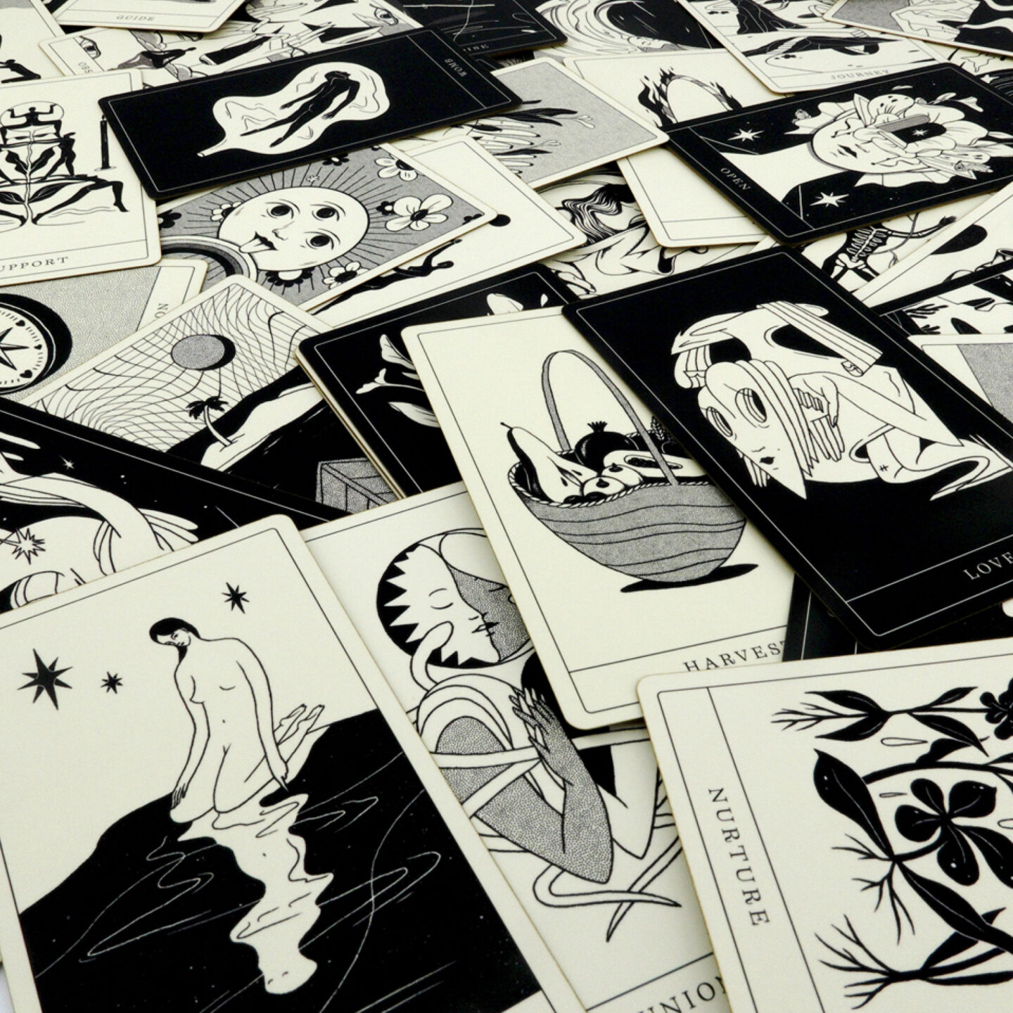
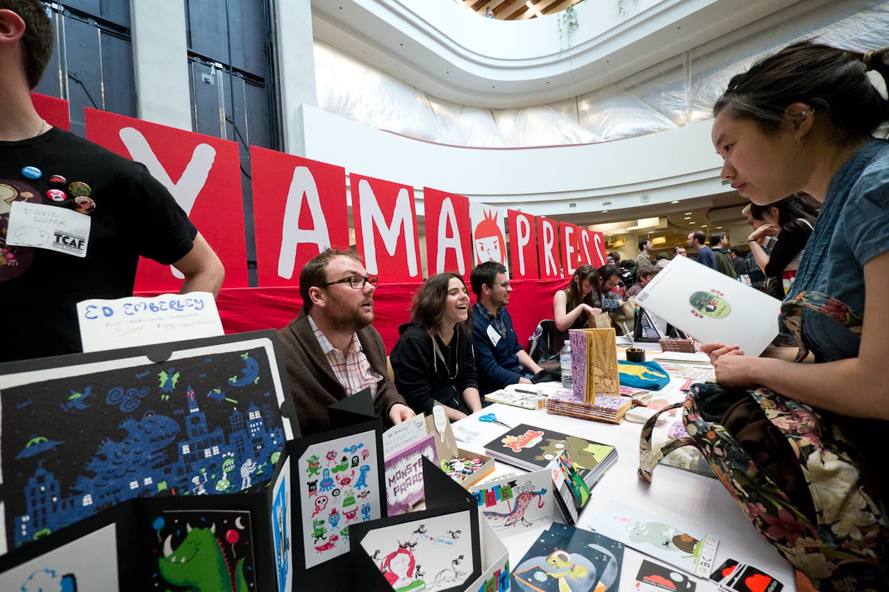
Annie Koyama, founder of Toronto’s small but mighty Koyama Press, has single-handedly built a successful publishing business bringing the brightest and weirdest of Toronto’s art and comics scene to world at large. Since its inception in 2007, Koyama Press has released an incredibly diverse catalogue of comics and art books, showing no sign of slowing down! We caught up with Annie Koyama to ask her about her approach to publishing and what the future holds for Koyama Press.
Koyama Press seems to operate in an almost philanthropic way, publishing artists and funding arts projects for the sheer love of it. Can you tell us a bit about how Koyama Press got started, and become so successful in a time when independent publishers struggle and money for arts is in short supply?
Anne Koyama: So far, that is totally true. After a health crisis, I decided to do something new, combining a couple interests – books and art, particularly by emerging artists. I’d spent some time looking at illustration and contemporary art sites and decided to contact a couple artists with the intention of sponsoring some small projects.
That ballooned into comics, zines, prints, art projects and of course, books.I think that I’ve achieved a bit of success in breaking out some artists to new audiences and bringing the artists a bit of income that they may not have had without me. It certainly is a challenge to be a small press publisher of art books and comics.
Your catalogue of artists is incredibly diverse, ranging from Michael DeForge’s loose comics style, Nicholas DiGenova’s meticulous animal hybrids, to the dream-like folktales of Tin Can Forest. Do you have a long-term creative vision for Koyama Press, or do you choose projects as they come along?
AK: People often remark on the diversity of the catalogue but it really just speaks to the kind of work that I like. I will continue to work with fine artists, illustrators, animators, street artists, printmakers as well as comic artists.The only constant for me is that I wish to maintain a certain level of quality.
Koyama Press has definitely helped nurture and encourage Toronto’s growing comics and arts scene. Do you have any advice for local emerging artists?
AK: Only to get out there with like-minded people, show your work, make art every day. See what other people are doing. It doesn’t cost anything to go to galleries, look at work online and use the library if you cannot afford to buy reference materials. Travel as much as you are able. Learn how to write grant proposals.
Koyama Press’s “Kickass Annie” logo has definitely travelled far with dozens of artists creating their own versions of Kickass Annie (http://on.fb.me/hVfEbJ). How did this get started? Any plans for an anthology collecting all the Annies?
AK: Initially, I commissioned a few artists to do their version of Aaron Leighton’s design. I wanted a few for my office wall. Once a couple of them were posted online, several people came forward asking to add to the collection. A couple people just surprised me with their versions.The collection is pretty amazing now and it seems to have come full circle with Aaron doing a version of his original version! I may put together a little book or zine of the versions when I have the funds.
Any upcoming books from Koyama Press we can look forward to? Given unlimited resources, what would be a dream project you’d like to undertake?
AK: Diego Bergia’s ‘Lepos Bible’ has just come out, Mark Laliberté’s book ‘Grey Supreme’ will be out in January and Michael DeForge’s ‘Spotting Deer’ will debut at the Brooklyn Comics and Graphics Festival in December.
With unlimited resources? I have lots of projects and a long list of draft picks with whom I’d like to work. And, I’d want to find a way to continue supporting the all of the artists in the current catalogue. Produce higher quality books too. The list is endless.
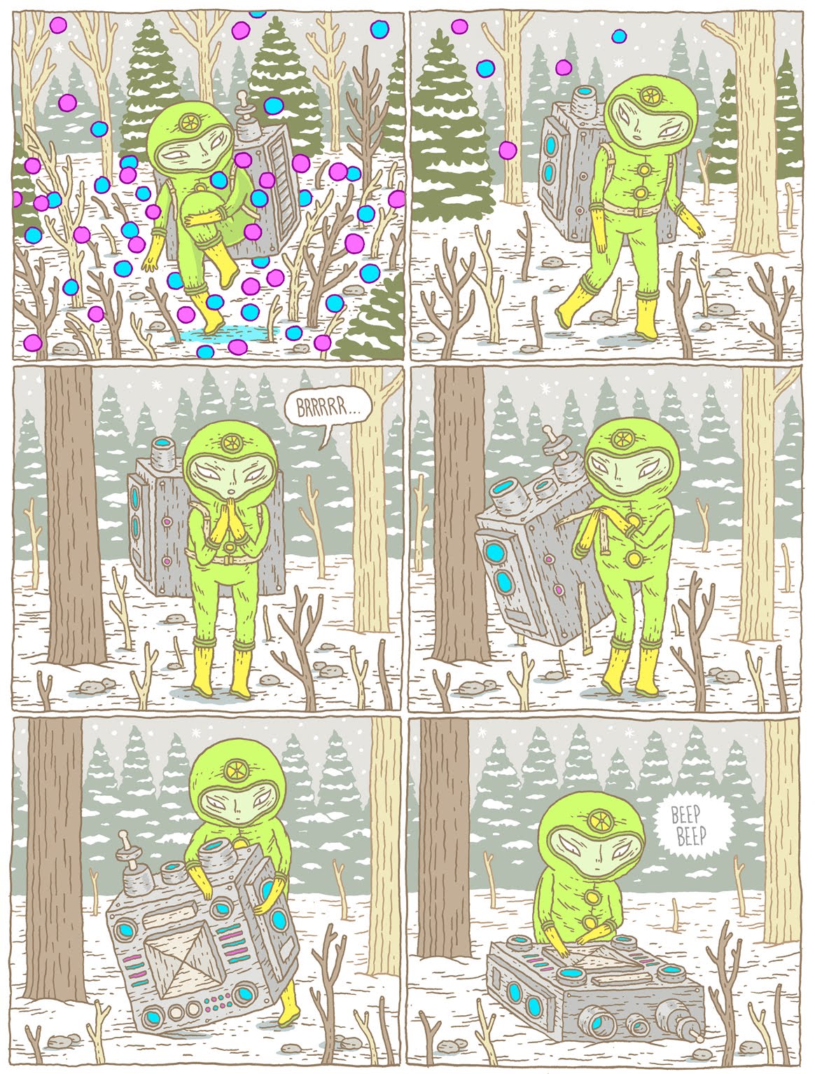
The natural world and the otherworldly converge in strange and beautiful ways in the comics of Canadian artist Jesse Jacobs. We caught up with Jesse to ask him about comics, the great outdoors, and his forthcoming book “Even The Giants”.
Though you’ve been known to design t-shirts, skateboard graphics, and illustrations, the bulk of your work is in comics. What is it about comics that attracts you more than other mediums?
JESSE JACOBS: My artwork has grown out of a lifelong interest in all forms narrative. Even in a lot of my non-comics work I tend to attempt to suggest some sort of larger story. Although it doesn’t come nearly as easy to me, I enjoy writing almost as much as I enjoy drawing. There is so much potential to do all sorts of interesting things in comics and I feel I have a lot further to go with them. That’s really exciting for an artist. I like the process and all of the facets of creating comics.
The process really allows one to stretch a lot of different creative muscles.Comics are what I’m most comfortable with using to express my ideas. I actually prefer reading novels to reading most comics, but I think that’s due to the fact that comics is still such a new medium. Though in the last few years I think there has been breakthroughs by brilliant artists who really illustrate the literary merit of comics. It’s exciting to be working in a medium with so much potential.
Nature and science-fiction are two very contrasting themes and aesthetics that crop up recurrently in your comics. Can you tell us more about the themes you explore in your work?
JJ: I’ve always enjoyed drawing robots and aliens and futuristic things. I guess it’s just taking me a bit longer to get that out of my system. I’m a huge Star Trek fan and believe that the science fiction genre is often misunderstood, and probably for good reason. A lot of sci-fi storylines are pretty weak metaphors for present day situations and have a tendency to come off hackneyed. For this reason, I think a lot of serious writers stay away from science fiction. Margaret Atwood writes fantastic science fiction books but she refuses to recognize they are science-fiction books. When it’s done well it’s a great framework to tell a story.
Primarily, for me, it’s an aesthetic preference. Science fiction allows the freedom to draw pretty much any nutty thing that could someday possibly exist or already exist in some other dimension and I often use it as an exploration in drawing. I haven’t yet done what I would consider a good sci-fi comic but perhaps some day I will attempt it. I’m also a huge western fan but I’m terrible at drawing horses and cowboys.
The same can be said for my interest in depicting nature. I have a lot of fun drawing plants and trees and animals. I also have a lot of fun being in nature. My dog loves to run around in the woods, which is great because getting out in nature becomes a necessity. If she doesn’t burn some energy she get’s kind of squirrely. Having a dog has been really good for me; I need to have an animal around. I spend large amounts time by myself drawing comics and she keeps me company and also forces me to get out for walks and exercise. Sometimes I take a sketchbook with me and draw and that practice has made it’s way into my comics.
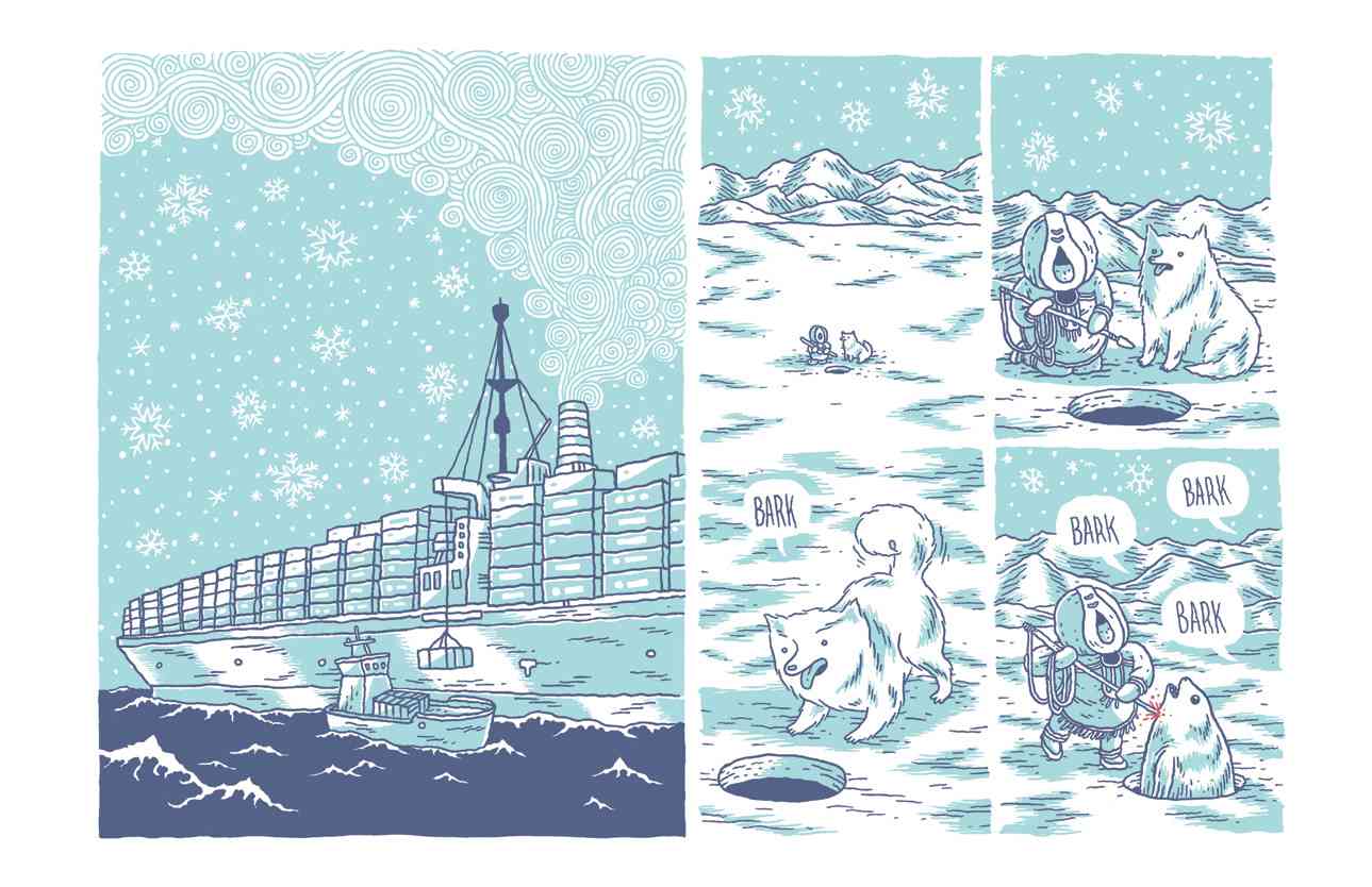
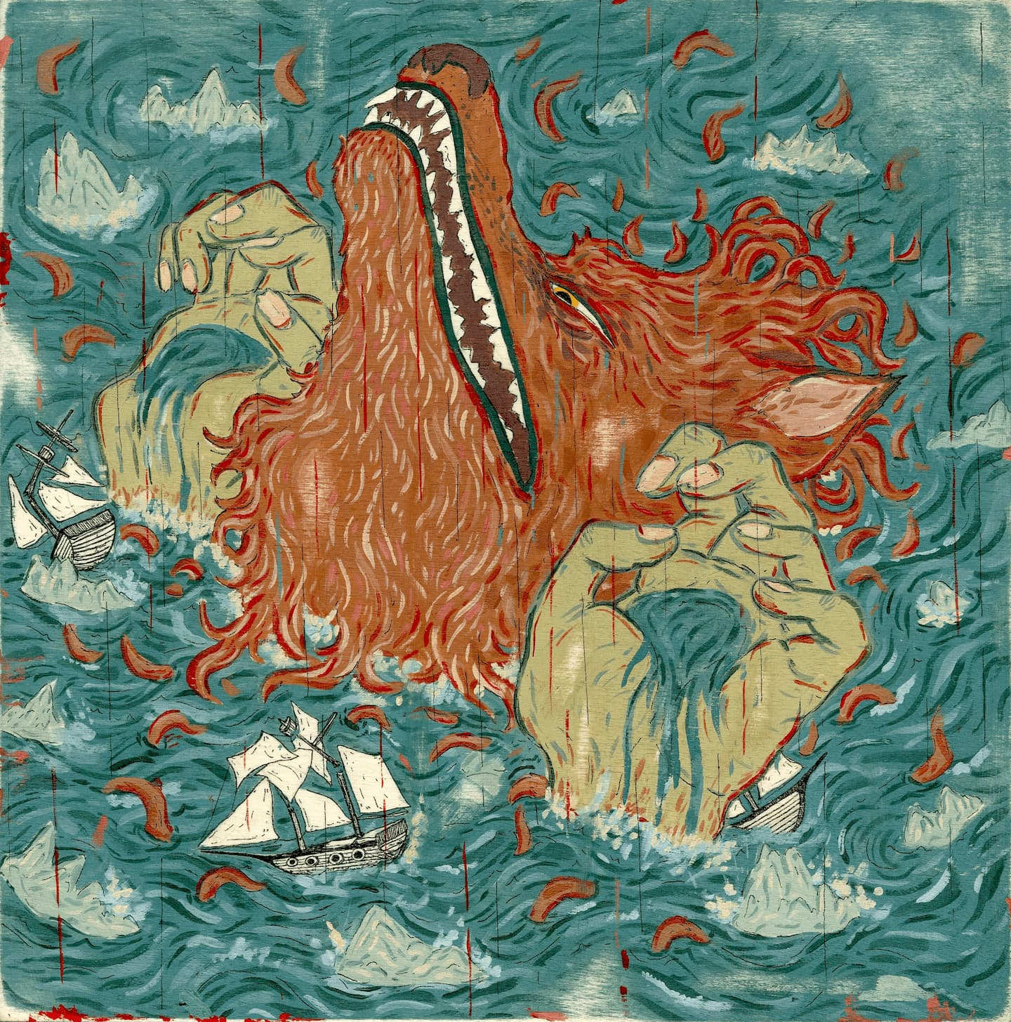
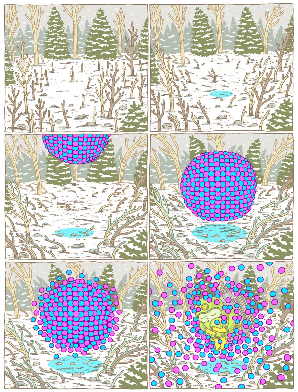
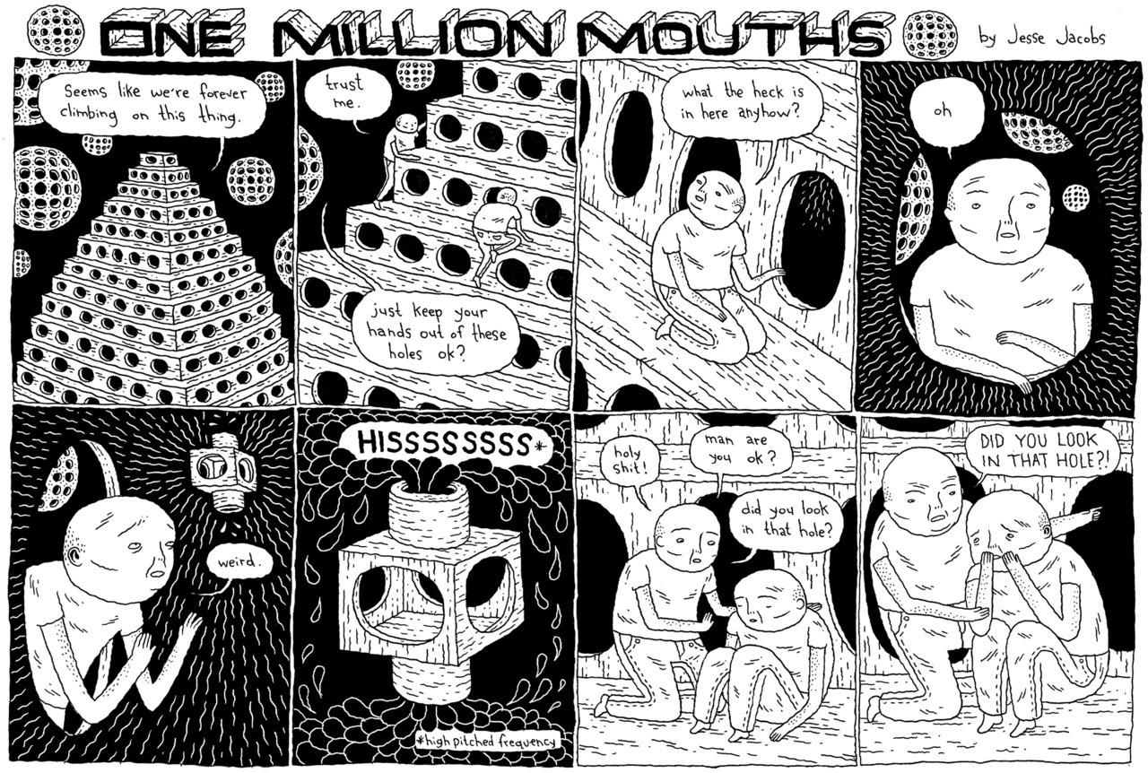
You recently previewed panels from an upcoming comic featuring embracing arctic monsters and flying Inuit over an almost lunar landscape. The images are amazing! Can you tell more bout this project?
JJ: Those were excerpts from my new book that ought to be out sometime early next year (2011). It’s a culmination of both styles of my comic work. The book will feature some of my One Million Mouths one-page strips peppered throughout a longer loose narrative featuring two giants in love walking around the arctic and doing weird things. It’ll be closer to my Small Victories book than any of my other work.
It’s being published by AdHouse Books, and will be the first book I’ve done that I haven’t released on my own. I’m really excited about that.
Canadian artist Peter Diamond got his first taste of illustration drawing gig posters for his buddies punk rock shows in high school. Now, from his home in Vienna, his work has evolved into beautifully intricate and surreal compositions.
How would you describe your work?
In terms of concept, I would have to say my drawings are something like visual short stories, at least the best ones are. Most often I want the viewer to feel they’ve interrupted some secret goings-on, and I give them just a glimpse of the story to decipher. I aim to nurse the ambiguities and free associations in my pictures without allowing them to become meaningless. In my simpler pieces based on more straight-forward visual metaphors, I do my best to add a touch of the unexpected or the subjective, to keep them from being one-liners.
In terms of technique: compulsive detail, obsessive composition, bright colours forced into dark schemes.
What made you decided to move to Vienna? With most business being conducted online these days, do you feel your choice of geographical location has an impact on your work?
I moved to Vienna to be with my girlfriend Lisa, who is Austrian. It was easier for me to relocate to the EU than for her to Canada, and I always wanted to live abroad anyway so it made sense for us.
I wouldn’t say that the internet makes an artist’s choice of location irrelevant by any stretch of the imagination, but I do think it gives us a lot more options. Publishing being what it is here, I think I’d be hard pressed to make a living in illustration in Vienna (unless I were a political cartoonist, they have a thriving bunch of political cartoonists here) if it weren’t for the internet, so in that sense it opens things up, but I believe that being in close proximity to your fellows and your clients remains a major advantage.
Having said that, Vienna has been a source of major inspiration. In Viennese architecture the kind of swirling organic detail and symbolistic imagery I love to put in my drawings is molded into my surroundings, and the museums are treasure-troves. And somehow, though I can’t quite put my finger on why, the multiplicity of languages on the street seems constantly to stoke my imagination.
Your bio tells us of how your early experiences as illustrator happened working on high-school gig posters. What have been your major influences since then?
Well since those day I’ve lived a lot of experiences and seen a lot of art, and they’ve all shaped the art I’m making now. If we’re speaking strictly in terms of artists, the most directly influencial since that time have been old-timers including Rackham, Schiele, Hokusai, Kuniyoshi, and Klimt. Contemporary artists such as Tomer Hanuka, Yuko Shimizu, Ghostshrimp, Sam Weber and Carson Ellis have lit some pretty serious fires under me, and I’ve recently become enamored with ornamental design and patterning, and the work of Viennese architect Otto Wagner.
Beyond all that the things I draw are very much marked by travel, reading about history and biology, and long hours of kitchen work.
You attended Yuko Shimizu’s Summer Illustration Workshop in Venice. Can you tell us a bit about that experience and how it has influenced your work?
That’s one more way moving to Vienna has been an advantage, as I likely wouldn’t have made it over to Venice from Nova Scotia. Taking Yuko’s course was one of the best decisions I’ve ever made. Yuko is a master, and happens to understand very well where I’m coming from artistically.
Marshall Arisman said something about when you’re learning from a teacher they’re not so much teaching you something new as reminding you of what you already know. I don’t know if I’d subscribe to that as an absolute, but I think in many cases it’s true. Yuko brought out into the light the weaknesses in my work that were nagging at the back of my mind, but that I had never seen clearly enough to resolve. That, combined with the encouragement to pursue the kind of drawing I most love to do, (and hence the kind of drawing I’m best at) resulted in some huge leaps forward in my portfolio.
The course was only a week long but sometimes I think I gained as much from that week as I did in 4 years of art school.
Your ongoing collaboration with writer Michael Kimber has yielded some wonderful work. Do you approach this type of project differently than usual client work?
Yes, definitely. Michael provides no art direction whatsoever, and we work simply on the understanding that I’m responding to his writing in an honest and spirited way. There are no real deadlines, and I do these drawings when I can get to them and when something in his writing sparks a reaction. I was very happy with the first two, ‘Champions Of Breakfast’ and ‘Empty Nest’, they were strong visual comments with a sense of humor. But the third piece ‘Treading Water’ is in my opinion one of my strongest works, and it was the result of a much more personal response to heavier source material.
‘Both Our Houses’ is a fascinating piece. Was this a personal project? Can you tell us about the image and what it means to you?
Yes, that was a personal piece. It’s about the effects of colonisation on the native nations of what is now Canada. This is a topic I first worked with at the end of art school, for my graduate exhibition ‘White Eyes’. There is so much to say about this part of Canadian history, and it’s such a huge part of that history, but for the most part we don’t talk about it much. It’s impossible to ‘tell it like it was’ because we’re too intimately involved with it and the historical sources are too one-sided, so I focus on my own responses to what I manage to learn and to what I see around me, and that response is dominated by horror and sadness.
Growing up as a Canadian kid, I learned throughout my schooling about ‘Les Amérindiens’ (I went to school in French), and I grew to love them. As I grew older and my interest remained, I continued to learn about them on my own and eventually I had to face up to the realities behind what I had learned in school.
In this piece the central image is the blanket of locusts and roaches, and this stands for the smallpox that wiped out huge swaths of the native populations, and the famous ‘Hudson’s Bay Blankets’ that helped spread the disease. In addition to that, I’ve made reference to the myths of the ‘Red Man’ in film and television that still dominate popular perception of native peoples, and the often-broken promises of the many Treaties throughout our history. There are other elements here of my personal reflections on the matter, but the above are the ones that best lend themselves to this sort of explanation.
What would you most like to see yourself doing in the coming years? Do you have any upcoming projects we can look forward to?
For now I’m just focusing on steady work as an illustrator. I’ve been treading part-time, semi-pro water for such a long time that all I’m really after at the moment is to keep this boat afloat full-time. Learning self-promotion and trying to do it effectively is a whole new art, and it’s keeping me pretty busy.
Further down the road I can imagine teaching or Art Direction, and if I allow myself to daydream (and of course I do) I like to see myself having my pick of clients and trying my hand at toy design, typography, animation and pattern design ( I would love to design excessively intricate wallpaper if only people still wanted it ).
I’m preparing to release a small edition of prints in the very near future. Right now I’m collecting suggestions through my facebook page as to which piece I should run, and an edition of 20 signed giclée prints will be available in the coming weeks.
There are always a host of hare-brained schemes in the incubator and it’s hard to say at any given time which ones will survive to adulthood. I’ve recently customized my first Munny doll and I’m looking forward to doing a few more, and Lisa and I have batted around the idea of a bilingual kid’s book (german/ english). Other than that I’m adding new work to my portfolio all the time, any interested parties can follow that progress on my site and my facebook page.
All images ©2010 Peter Diamond
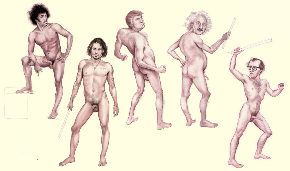
The always beautiful, funny and incisive work of artist/illustrator Anita Kunz has long been a favorite of ours here at S&TM. Her new exhibition, with fellow artist Maurice Vellekoop, titled The Naughty Show treats us to no less than 100 nude portraits of famous men.
Portraiture and parody have always figured prominently in her illustrations (gracing the covers of Time Magazine, Rolling Stone, Vanity Fair, The New Yorker). In The Naughty Show these are combined with her beautifully expressive attention to the naked form, often explored in her fine art work.
Anita’s meticulous watercolor renderings of Gandhi, Gene Simmons and Alfred Hitchcock (to name a few) are alive with the personalities of her subjects. Don’t miss The Naughty Show, currently on display at One 800 Gallery in Toronto.
The Naughty Show consists of 100 nudes of famous men. Could you tell us about what inspired the theme, and some of the ideas you were exploring in making these portraits?
Well the genesis of the work was actually fairly serious. I’ve been aware for a while that the fine art world is not gender neutral, and it still isn’t a level playing field. I frequently teach in the US and particularly in the south, when we draw from live models, they are always women. When I’ve complained about it, the answer is that women are better to draw (!?). And looking back at the history of art, there really are far far fewer depictions of nude men than nude women.
So I thought I’d do a series of male nudes, and while I was at it I thought I might as well make them portraits of famous men! John Currin painted a nude of Bea Arthur so I thought why not?
We loved the wildly different forms and figures of the various celebrities in the show. Were their bodies drawn straight from your imagination, or did you have some secret reference material? What was your process like when creating these images?
Well despite the serious intent the actual drawing was a lot of fun. I allowed the personalities of the men to suggest the anatomy. It was all from my imagination but I used old anatomy books to inform the poses.
Was it a deliberate choice to have the show premiere coincide with pride week here in Toronto?
Yes the show was intended to be a celebration of Pride. And I was so thrilled to show with Maurice Vellekoop. He’s an amazing artist and dear friend.
Mainstream media still has a lot of hang-ups when it comes to showing male nudity. Was showing famous men in the nude a way to address this?
I was actually a bit nervous about the possible fall out (i.e. would Donald Trump sue me? ) But ultimately it’s parody, so its intent was to be a subtle way to poke fun at convention.
Do you approach your fine art work differently from commercial illustration projects? Do you have a preference for one or the other?
I’ve always considered myself an illustrator/ visual story-teller. So even when I do my personal work, it’s illustration-oriented.
I try to make comments and create narratives. The biggest difference is the fine art is self generated. And I suppose the fine art can be more challenging to the viewer because it doesn’t exist in a context (magazine) that must not offend anyone. So there’s no censorship there.
I don’t prefer one over the other. I’m just as happy to do illustration work where there’s minimal art direction than I am to do personal work. Interestingly I’m my own worst critic, so it’s not any easier to do personal projects!
Images © 2010 Anita Kunz
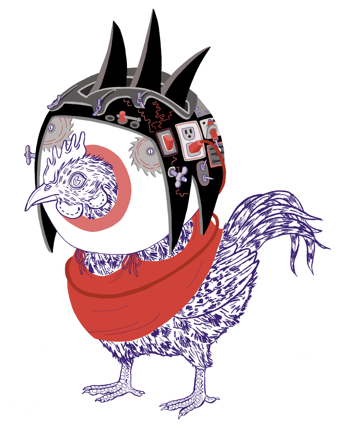
Severed snake tails, speech bubble constellations, and troubadour birds populate the alchemical dreams of UK-based artist Nick Sheehy. Through strange geometries and intricate crosshatching, Nick Sheehy’s drawings describe worlds of mystery and wonder. A sense of theatricality pervades the scenes in which the subjects are also the storytellers.
S&TM: Given how often the character appears in your works, we thought we needed to ask: is the chicken your spirit animal?
Nick Sheehy: Ha ha. Um… No. Truth is I have no more connection with chickens than any other animal. Showchicken was a name I gave my website when I used to draw obese chickens many moons ago. It seemed fitting at the time, but there was no plan of the name sticking. Now the obese chickens are in the past and I draw other stuff.
To me, the name ‘showchicken’ has taken on the same sort of meaning as a brand name … the individual words no longer retain their meaning and it has just become a sound.
I don’t really see my characters as chickens. They are mostly birds, but not usually from a specific family.
S&TM: We’ve been trying to decode some of the recurring motifs in your paintings: severed snake tails, speech bubbles in the forms of constellations, nodes or molecules. Without giving too much away, would you discuss what some of these mean to you?
Nick Sheehy: I don’t think I’m interested in singular or explicit meanings. I like uncertainty, and shades of grey. I also think that the meaning interpreted by the viewer is just as interesting as the one intended by the creator. I tend to just draw without thinking too much and I try to draw scenes I have never seen before.
Most of the visual elements you see come from my personal experiences. I draw a lot of birds and snakes, because that’s what was around me as I grew up in Australia. I like drawing guitars because I play guitar and my dad kept giving them to me as birthday presents.
The costumes are probably inspired by my girlfriend’s quilting. I draw wooden structures when I am making things out of wood (for the garden for instance) and I draw lots of plants when new growth is all around in Spring.
When you group these objects together over the space of a few works, you can start to build up colonies and worlds of varying weirdness where new narratives and mythologies start to evolve and everyday objects start to take on magical qualities.
S&TM: There’s a certain amount of pageantry going on in your images: characters in costume, carrying instruments, marching in parade formation. We often feel like we’re not seeing the real story, but characters putting on a play. Is this what’s being referred to in the name “Showchicken”?
Nick Sheehy: That’s an interesting take on it. I guess I do like a sense of theater. Like you are watching an unscripted performance. At the risk of sounding too deep that’s kind of what the work is about, all the performances and rituals that we go through as we live life: following rules and laws, sacrificing to the gods, exchanging goods for currency, meeting people, hunting for food, encountering hierarchy, dealing with other customs. I suppose it’s a mutant anthropomorphism in play.
I always feel my work has a sense of alienation and un-comfortableness to it, all wrapped up in a slightly banal hallucination. Which is sometimes how I view life. To me, things like going to the dentist, getting on a bus, speaking to a person on the phone halfway around the world to sort out your broadband, are typical and mundane activities and yet sometimes they can seem like the weirdest things in the world to do.
S&TM: We’ve been loving the new sketches posted on your Flickr page. Can you describe some of your approach to exploring new ideas/directions in your work?
Nick Sheehy: It all stems from the fact that I felt that what I have been drawing was starting to feel like it had plateaued. I was starting to feel limited by what I was drawing and how I was drawing it. Many of my drawings have usually involved some element of planning. The cross-hatching technique can be tedious enough as it is… but if you then introduce planning and layout into the mix… you’re setting yourself up for a slow way of making work.
The new sketches are where I have set rules for myself: no birds, no snakes, no planning, etc in the attempt to free myself from what I thought was holding me back. Most of my favourite artists work involves high levels of ‘winging-it’ and it’s exactly this that I wanted to be able to do. Basically I just wanted to make more fluid work, quicker.
I’ve also found over the years that working in a naive style had made me become a lazy drawer. So through my latest drawings I’ve tried to become more observant, and more technically aware of what I was drawing.
S&TM: Given the opportunity, what would be a “dream project” for you?
Nick Sheehy: I’ve already worked on a few “dream” projects that ended up being the opposite. But I would like to work on a book or a comic. That’s going to have to take some planning and I have no idea what sort of book it would be.
I generally enjoy projects where the brief is just to do what you want. I find creating for media that isn’t paper is enough for your brain to start working differently. Even if you aren’t given much direction.
Oh yeah, and my dream job as a kid was to design album covers. Up to now, this still hasn’t happened. I used to be into heavy metal and the associated imagery… not sure if there many metal bands out there in the market for birds in suits strumming weirdo lutes.
S&TM: We want to extend a huge thanks to Nick for taking the time to do this interview and for being a constant source of inspiration. We wish you all the best in your future projects.
Images © 2010 Nick Sheehy